
Home Listing Onboarding
- Company
- Modern Care Homes
- Role
- Design Engineer
- Team
- With Spencer Grzincich, Software Engineer
- Status
- Shipped
- Product Design
- Design Engineering
- Illustration
- Motion
- React
- TypeScript
- SVG
- Activation Flow
- Short steps from a license to a submitted listing
- Care axes, each with its own illustrated plot
- Up from 23
- Care camera while it pans
A guided flow that takes a care home owner from their state license to a listing ready for review, one short step at a time. I designed it and built the front end.
Problem
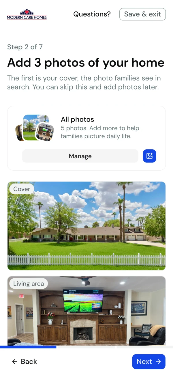
A new owner only got in when an admin invited them from their license. They landed in the full listing editor with a checklist, couldn't save a draft without three gallery photos, and publishing put the home straight in front of families with nobody checking it first.
Task
Give owners a way to claim their own home and get it to a listing worth publishing, without starting in the full editor, and give the Modern Care team a look at every home before families do.
Process
Designed and built in code, one step at a time, with each step in Storybook at desktop and phone widths. Spencer's care taxonomy set the structure of the care step, and the flow ships behind a feature flag.
The problem
Modern Care Homes lists residential assisted living homes in Arizona. Every one of them already holds a state license, so the owner and the address are on record before the owner ever visits the site.
The first version used that, but only from the admin side. An admin invited the owner from their license, and the owner landed in the full Manage Home editor with a checklist of everything a listing needs. Nothing would save without three gallery photos, and the publish button put the home live right away.
The design solution
- 01Start from the license.
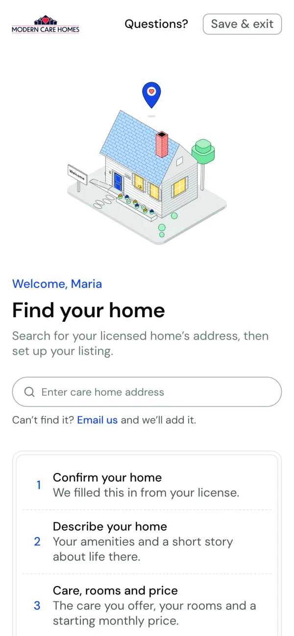
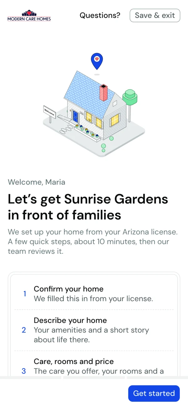
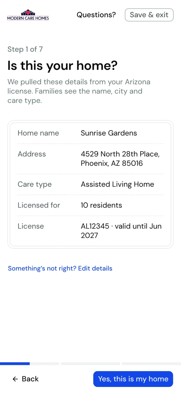
Owners search for their own home. Picking it fills in the name, address, care type and capacity from the state record, so the first question is just "is this you?" Progress is underway before they type anything, which is the whole point of momentum.
- 02One topic per screen, saved as they go.
Seven short steps in three phases, each saved on its own. Photos and care are no longer required for a draft, so an owner can stop at any point and pick up later. Progressive disclosure does the rest: each screen asks only what its step needs.
- 03Draw the home as it's described.
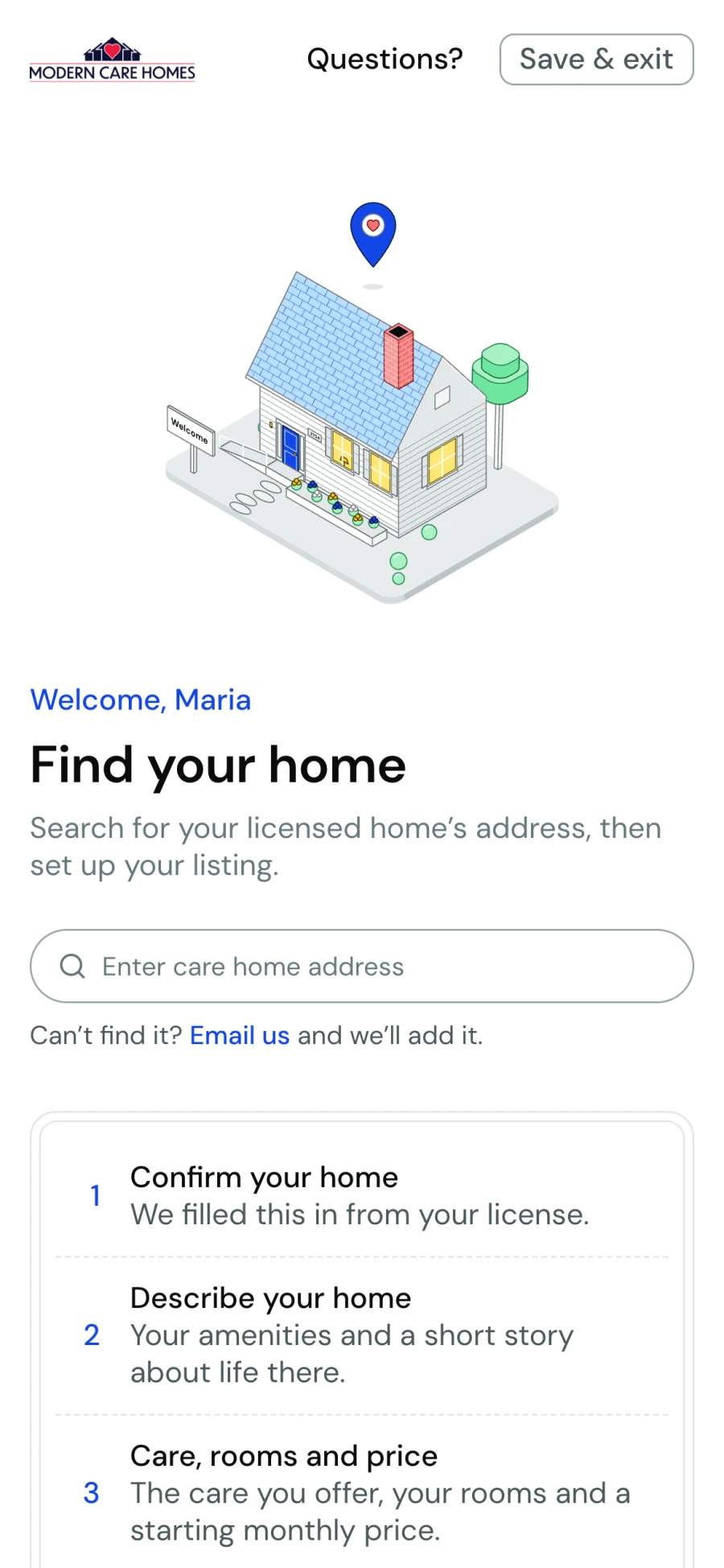
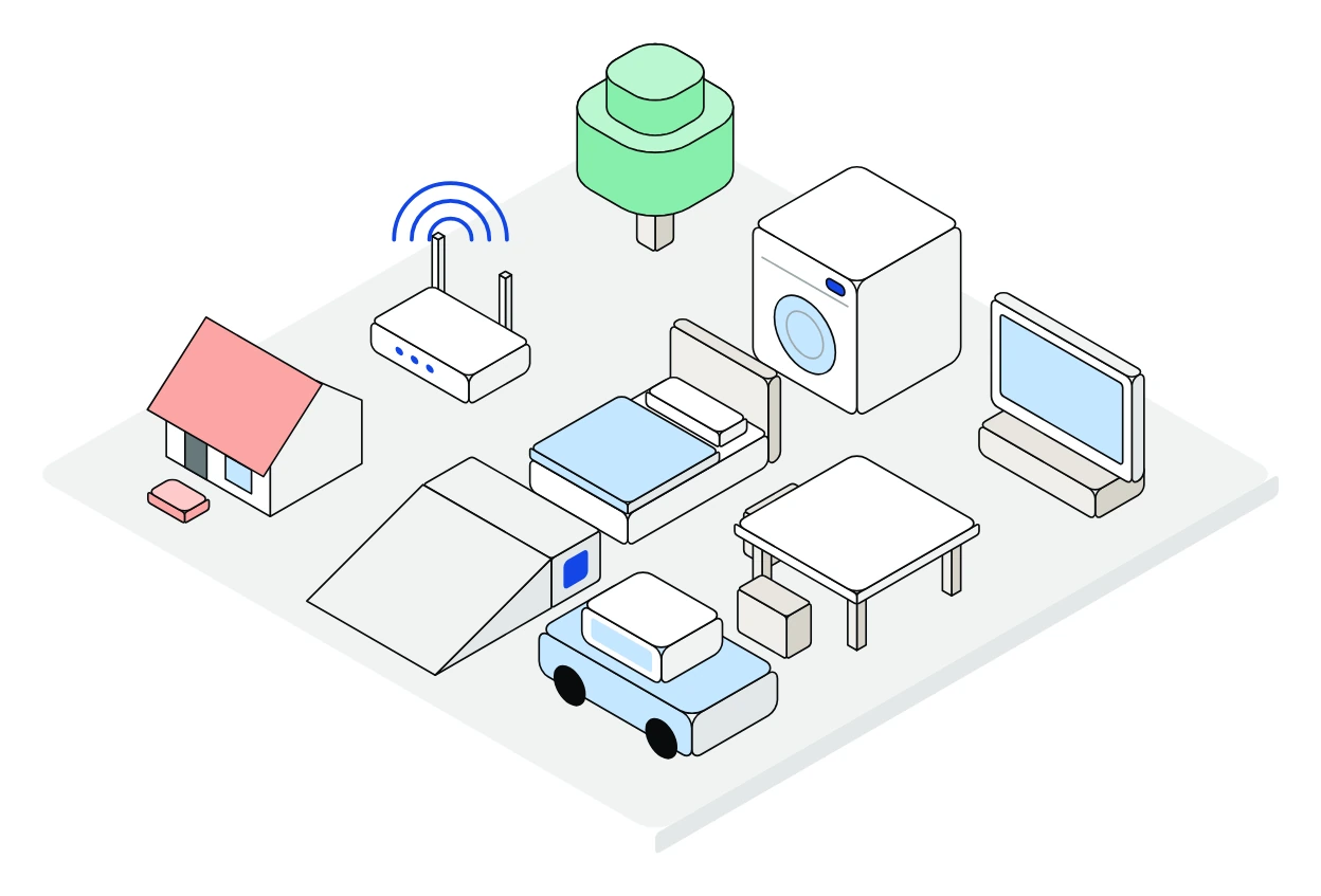
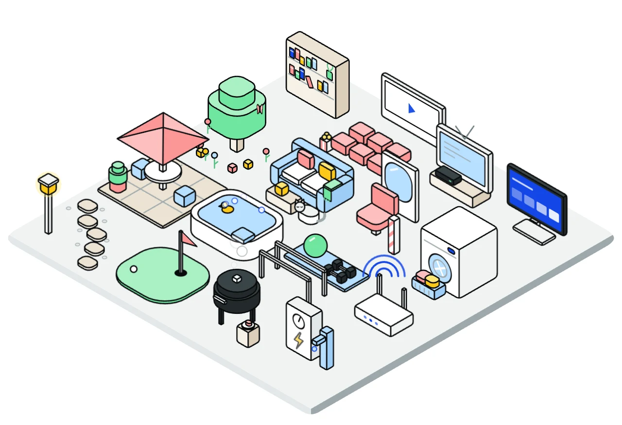
Every step has an isometric illustration that reacts to the form. Long checklists turn into a yard that fills up, which shows progress better than a counter does. It borrows the reward of a game's progress loop without the points and badges.
- 04Review before families see it.
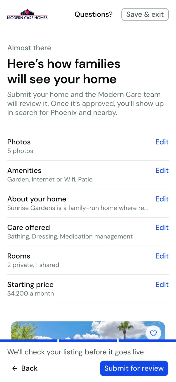
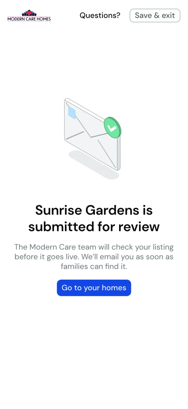
The last step submits the home to the Modern Care team instead of publishing it, and emails them a link to check it. That step is friction on purpose, the one place a slower path protects families.
- 05Readable for everyone.
Welcome text stays at 16px or larger, the illustration pins above the form on phones, and on touch screens a tap never moves the page.
Step by step
How it got here
The illustrations started as a way to make a long form feel shorter, and changed a lot once I could click through them.
The yard started as an empty lot
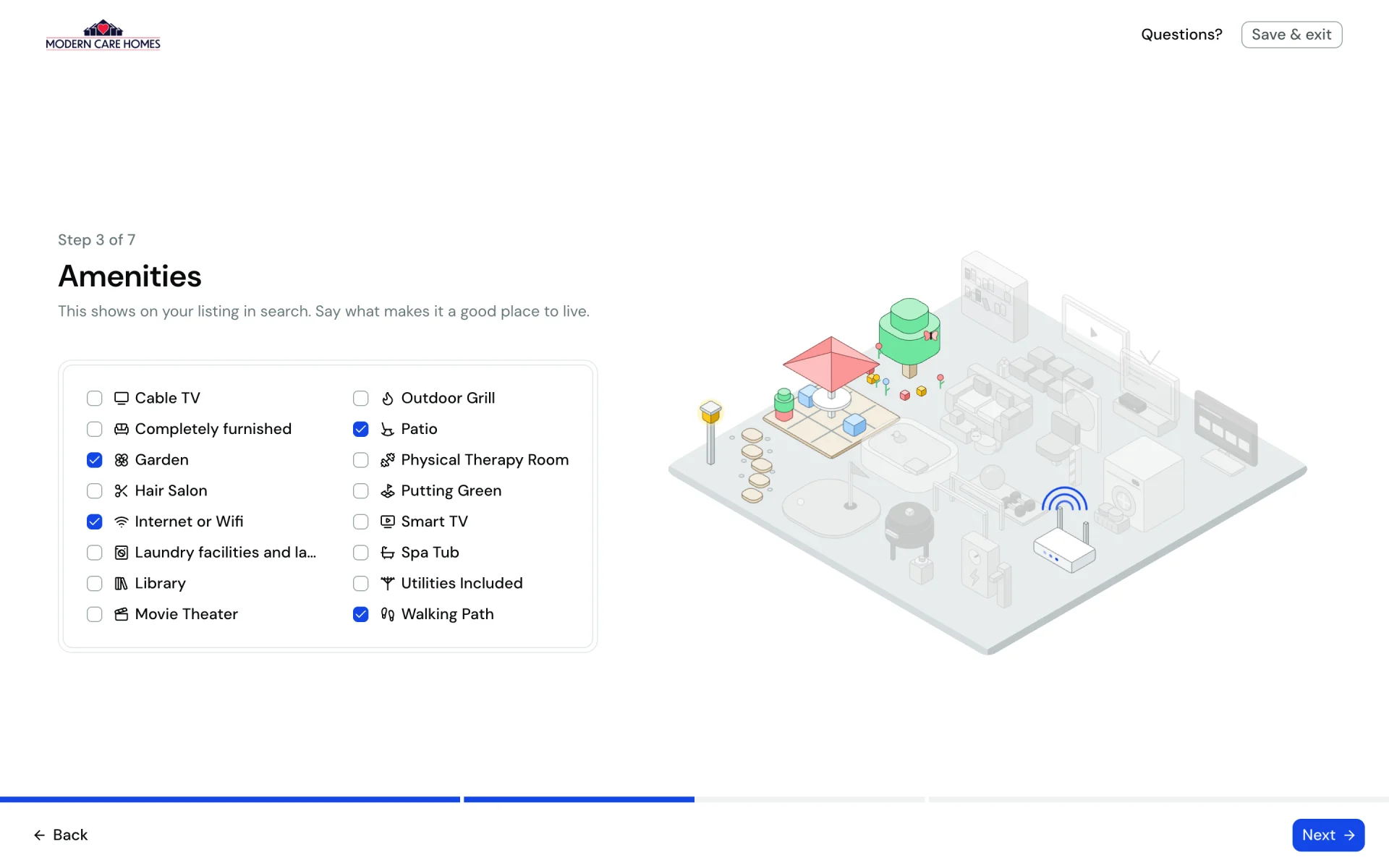
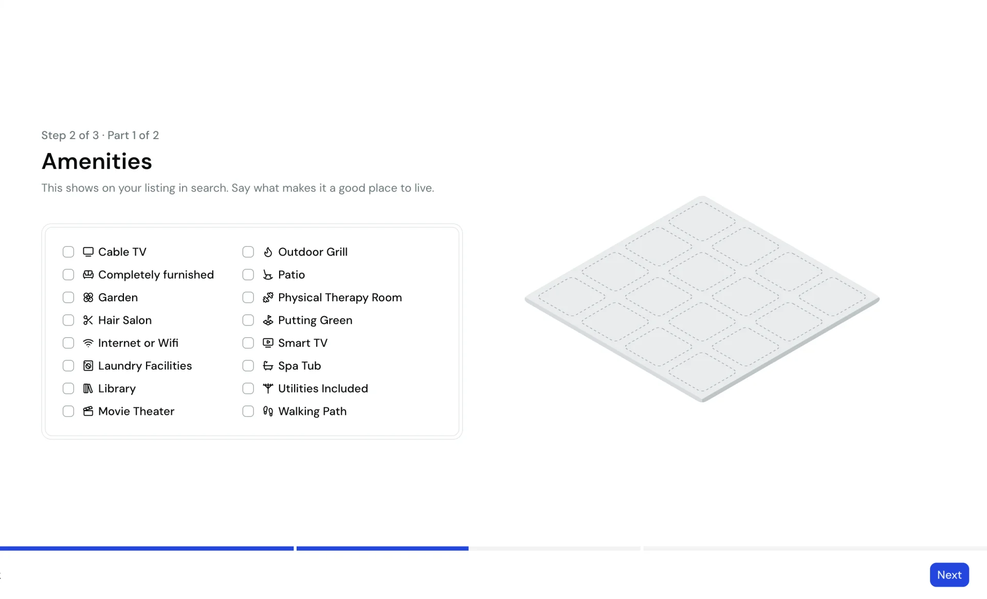
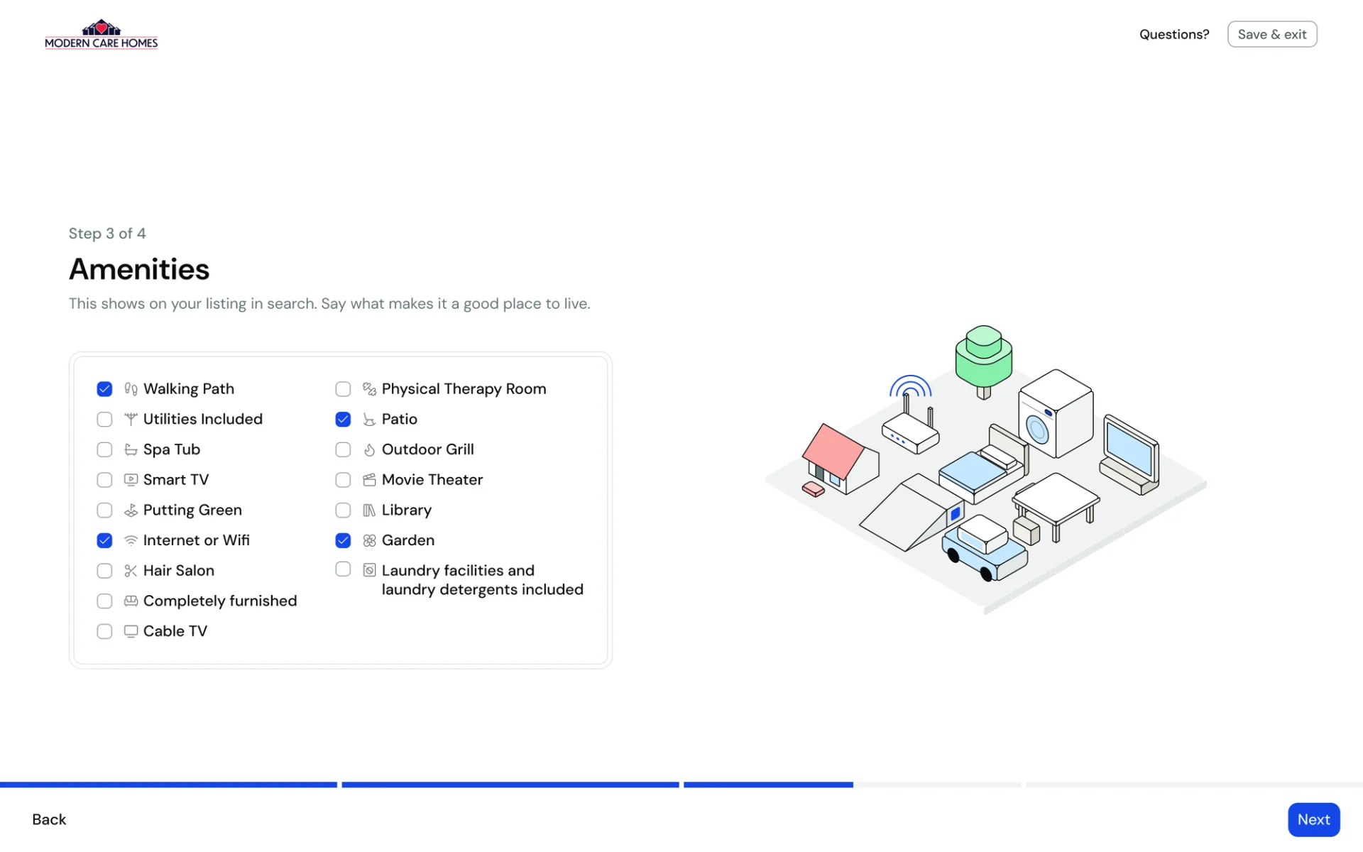
The first amenities stage was a blank grid of plots waiting to be filled. The next version filled them, but in black outlines with flat color, and the objects floated with no sense of a place. The shipped yard keeps the line work but lightens it, brings in Modern Care's palette, gives each object its own detail and an animation when it lands, and arranges them like a real backyard.
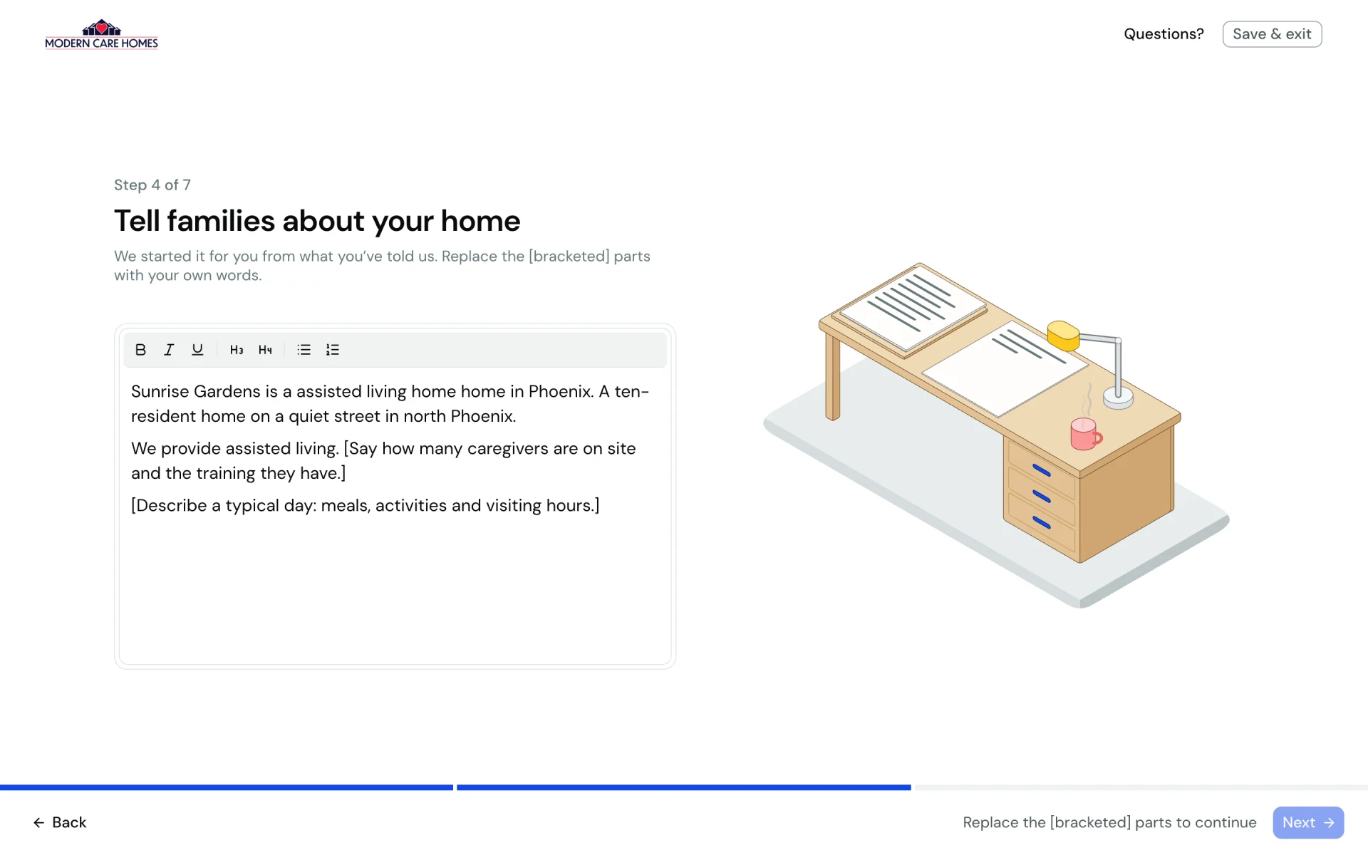
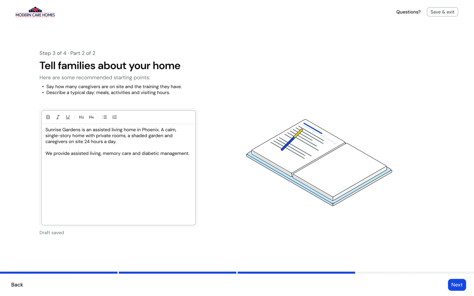
The book became a desk
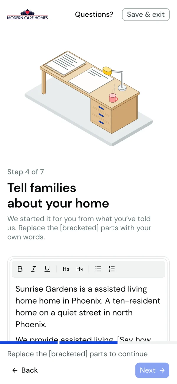
The About step first opened on a blank editor with tips above it and a book being written in. The desk replaced the book, the letter on it fills in as the owner types, and the tips moved into the draft itself as bracketed prompts, so the owner edits instead of starting from nothing.
The care yard got a camera
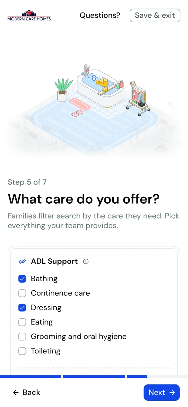
Early on, the whole care yard sat above the checklist at once, and on a phone each object was small. Splitting care into one plot per axis, and adding a camera that moves in close to the axis being edited, made every tap visible.
An illustration system
I wanted setting up a listing to feel delightful, not like paperwork. The illustrations carry that: each one moves as the owner answers, so every checkbox and every room gets a small reward on screen.
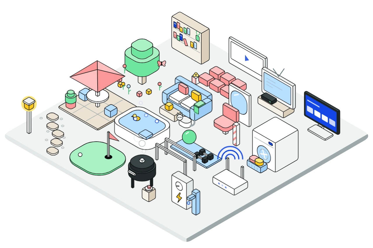
The figures are one isometric system, drawn as SVG components in the codebase and animated in CSS, so each one reads the form's state directly. Nothing is a static export.
From a skill to a brand
I started the figures with iso-figure, a skill that has Claude draw isometric line art as plain SVG. It gave me a base where the angles, line weights and proportions already agreed. From there I designed on top of it in Figma to make it friendly and on brand: fuller color from Modern Care's palette, softer shapes, and a yard with room for every amenity an owner can pick.
Every care attribute
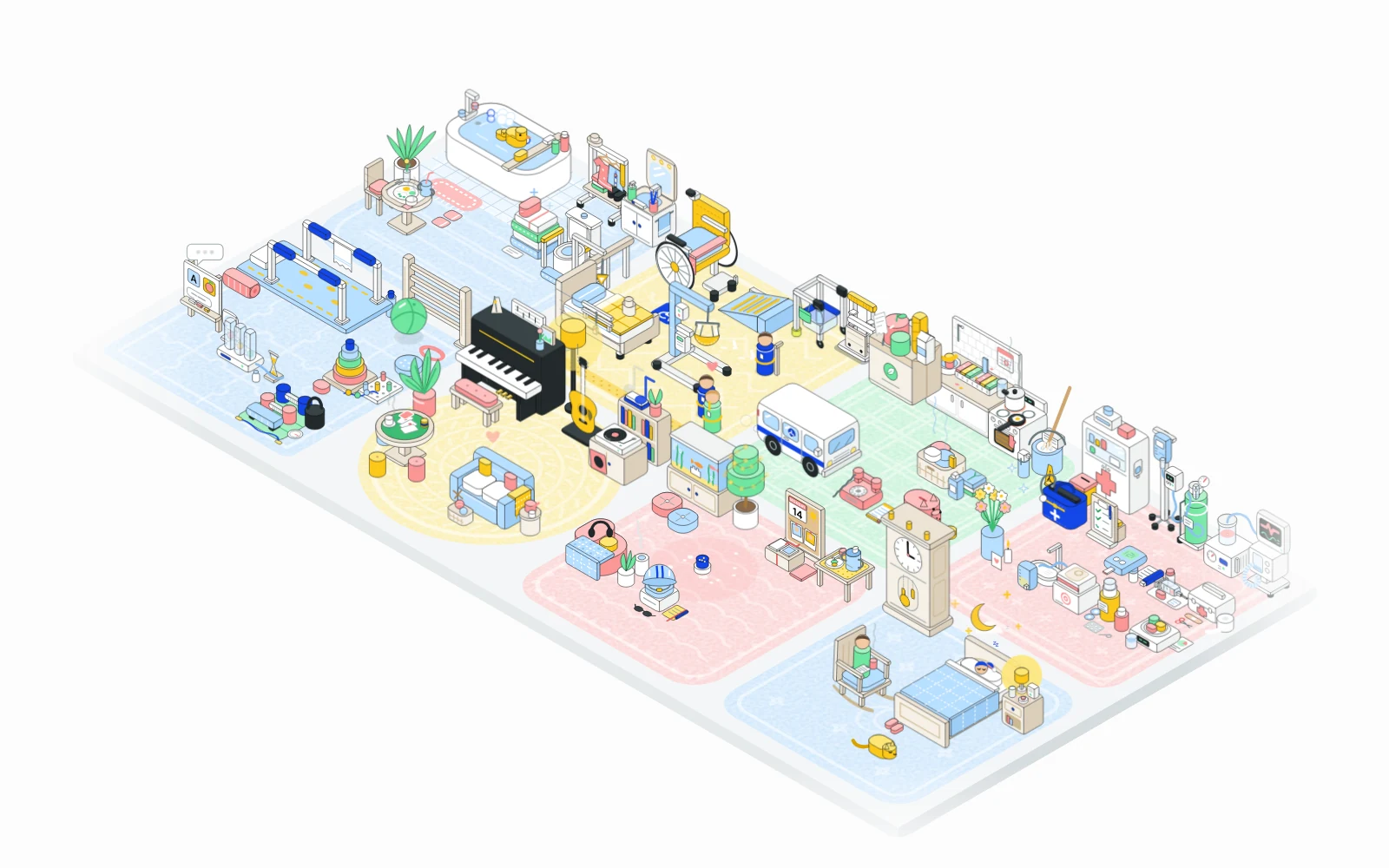
The yard draws 48 care services, each with its own object, chosen so it reads at a glance: a rubber duck for bathing, a pill organizer for medication, a piggy bank for money management.

Here they are on their own.
- ADL

Bathing
- ADL
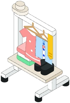
Dressing
- ADL
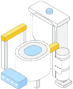
Toileting
- ADL

Continence care
- ADL

Eating
- ADL
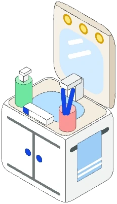
Grooming and oral hygiene
- IADL
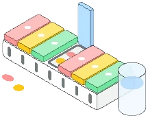
Medication management
- IADL

Meals


After it's live
Once the team approves a home, the owner keeps it current in the Manage dashboard, the editor new owners used to land in on day one. Spencer built the dashboard; I redesigned the two pages owners come back to most, so they read like the flow that came before them.
Care, in the same eight groups
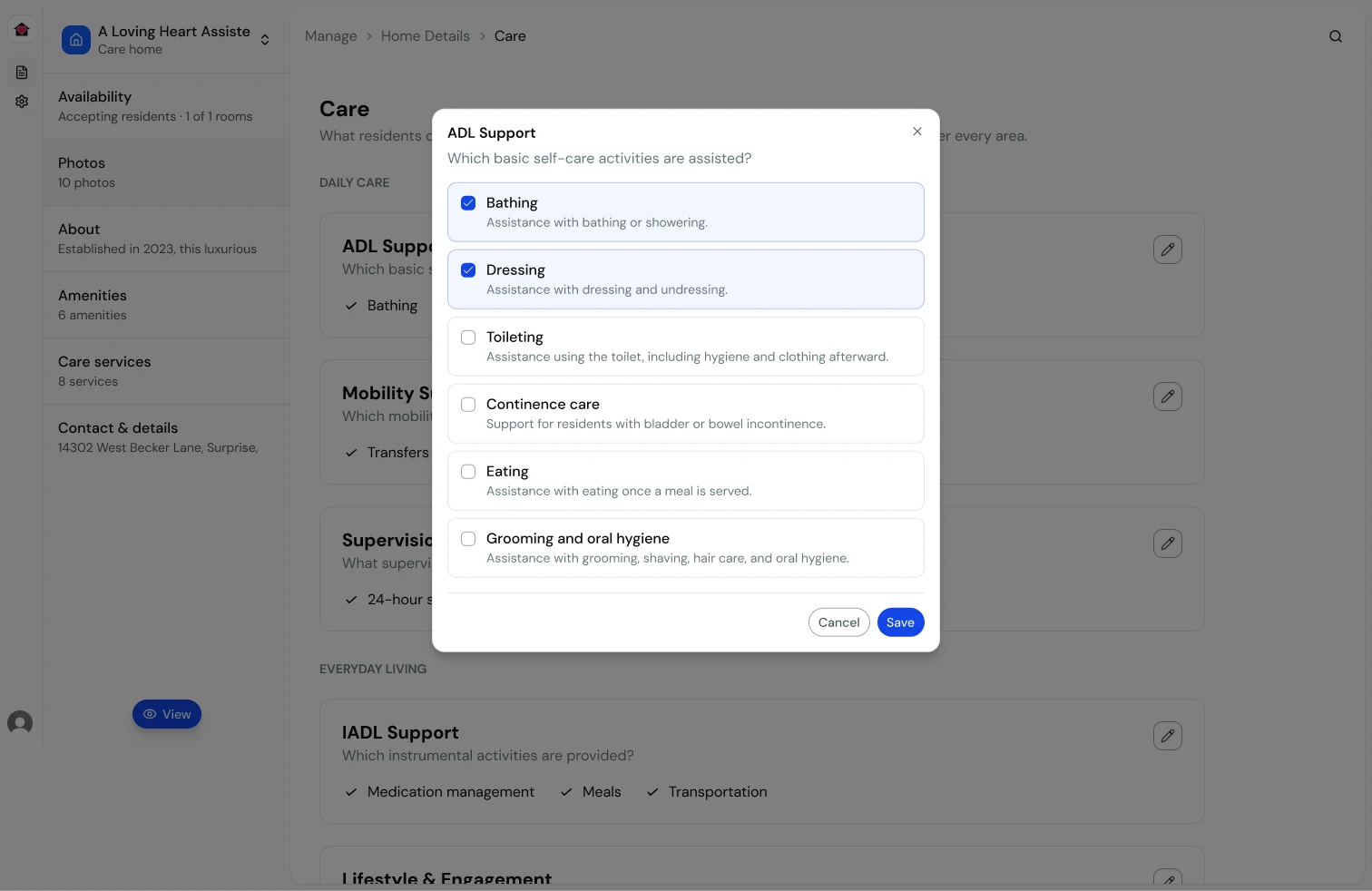
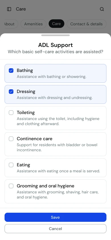
The care step and the dashboard share one taxonomy. Care is grouped by the same eight axes, and in the dashboard each axis opens in its own dialog, a bottom drawer on a phone. Saving one axis replaces only that axis's answers, so two people editing different parts of a home don't overwrite each other.
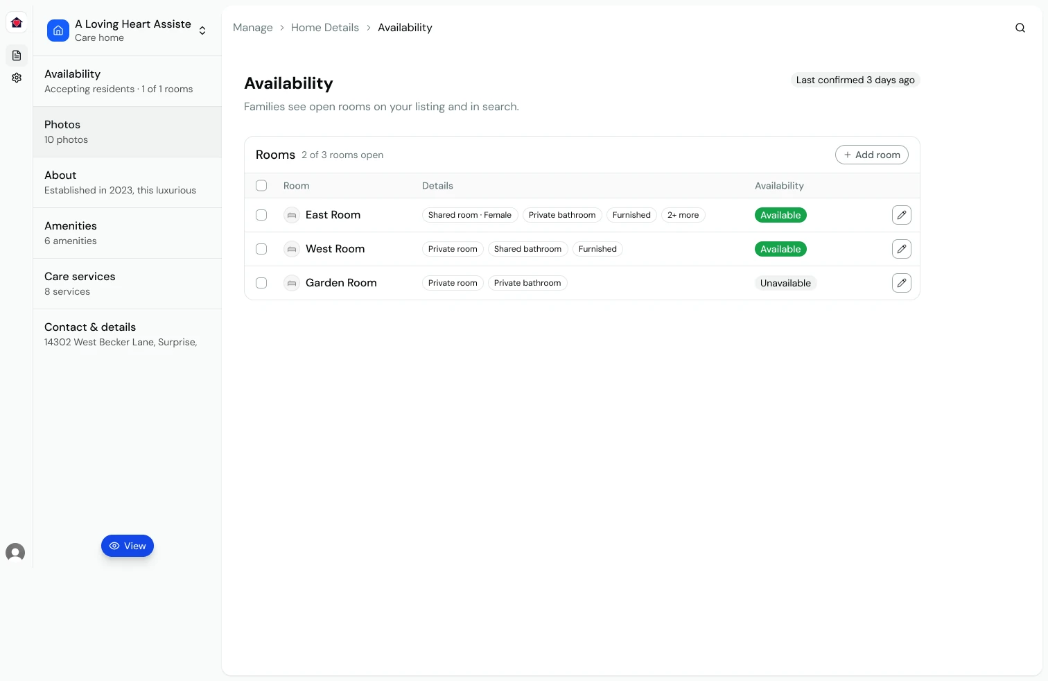
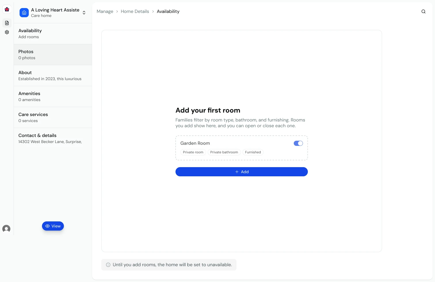
Availability families can trust
Open rooms are what families act on, so the Availability page leads with how fresh they are. A badge reads when the owner last confirmed them, rooms sit in one table with their details as chips, and several can be updated or removed at once. With no rooms, the page shows an example room and says plainly that the home stays unavailable until one is added.
How I built it
I designed this in code rather than in Figma. The flow and its illustrations were new, and the questions that mattered, like how a yard fills up, how a camera pans and how a step feels on a phone, only had answers once they moved.
- Storybook first. Every step has stories at desktop and phone widths, including the awkward states: an empty price, a shared room with no gender set, a review with something missing.
- Smooth motion. The care camera panned at 23fps. Moving the transform onto the SVG's own box brought it to 60.
- Built on the shared system. The steps use the product's design system components, with one new pattern: a double-bordered panel that frames every block of content in the flow.
- Tested where it counts. Submitting is covered for an incomplete draft, a non-owner and a home that's already been submitted.
Where it stands
The flow is complete and running behind the home-onboarding feature flag
while the pull request is in review. Before it opens to owners I want to
check touch behavior on a real phone, and then measure time to submit and
where owners stop, step by step. The next piece I'd design is the email that
says a home is live: it should show owners their listing as families see it,
so coming back feels like picking up where they left off.