
Modern Care Homes
- Company
- Modern Care Homes
- Role
- Design Engineer
- Team
- With Spencer Grzincich, Software Engineer
- Type
- Ongoing contract
- Product Design
- Web Design
- Design Systems
- Front-End Development
- Accessibility
- Next.js
- React
- TypeScript
- Tailwind CSS
- Figma
- Storybook
- Mobbin
- PostHog
Overview
Modern Care Homes is a senior living marketplace for the Phoenix metro. Families search independent and assisted living homes across six cities, compare them, and contact a home directly. Agents list and manage those homes on a second product, the agent platform.
Users
Two very different people use the marketplace for the same task, and neither has patience for an interface that gets in the way.
Their adult child
On a phone, short on time
- Often in the middle of something stressful
- Comparing six homes to find cost and care level fast
The resident
Usually over 70
- On a tablet or a desktop, with the browser zoomed way in
- Deciding whether a place looks like somewhere they could live
Both stall at the same step. The flow is search, compare, contact, and families are mostly ruling homes out, so compare is where I put the work.
My role
- 01Pattern researchMarketplaces, in Mobbin
- 02FigmaFoundations, tokens, components
- 03StorybookEvery state, in isolation
- 04ShippedMarketplace and agent platform


One design system, two products
Every component runs in both the marketplace and the agent platform, so a change to a button changes two products.
- Storybook
- shadcn
- Tailwind
- Base UI
Building the design system
Tokens, foundations, and components, each built and argued with in isolation before it lands on a page. The accessibility floor is built into every component.
- Vercel
- Next.js
- Figma
- Mapbox
Using it in context
The marketplace families search and the platform agents run it from, both shipped on the same library: search and map, listing creation, and the pages in between.
Working with Spencer
I design and build the front end. Spencer Grzincich, our software engineer, owns the data layer, so we split the work along that line.
Me
Everything families and agents see
- Components, layout, responsive behavior and motion, shipped as code
- Accessibility tested on the real build: contrast, focus, keyboard, zoom, targets
- What I learn shipping goes back into the system
Spencer Grzincich
The data layer
- How home data is modeled, stored and served
- The integrations, and keeping it all running
- The only work I hand off is work that touches his side
Marketplace research
Senior living is a marketplace problem first and a healthcare problem second, so I studied real estate marketplaces alongside care sites. I used Mobbin to study Airbnb's and Zillow's listing editors and activation flows, and researched competitors like Seniorly on my own.
Marketplace
Real estate search, in Mobbin
- Filters, result density, map and list views
- Saved homes, and what a card shows at a glance
- What doesn't carry over: we filter by care level, and the person deciding often isn't the person moving in
Agent platform
Airbnb's listing flow
- Mapped screen by screen, with Zillow's close behind
- What the host is doing, seeing and thinking at each stage
- What works, and where the openings are
Marketplace design
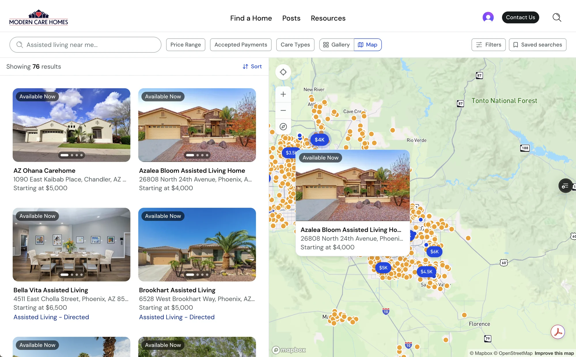
Filter controls
Families narrow by price, accepted payments and care type, and can save a search to run again later.
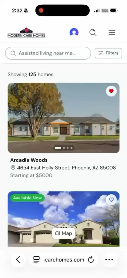
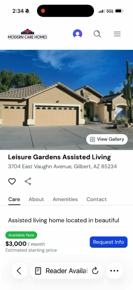
On a phone
Documented in Figma
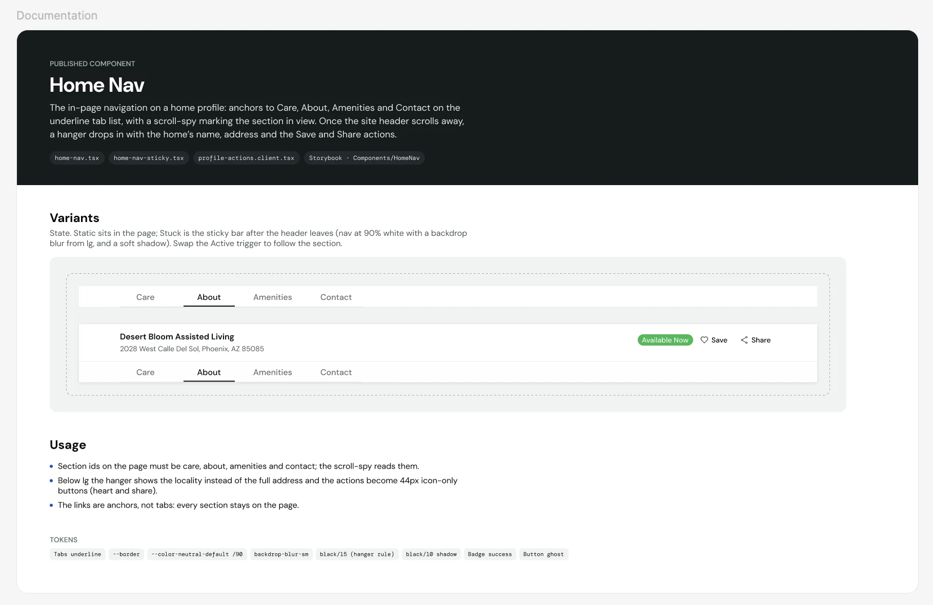
Each component gets a documentation page in the Figma library, with its variants, usage rules, tokens and the code files it maps to.
Component redesigns
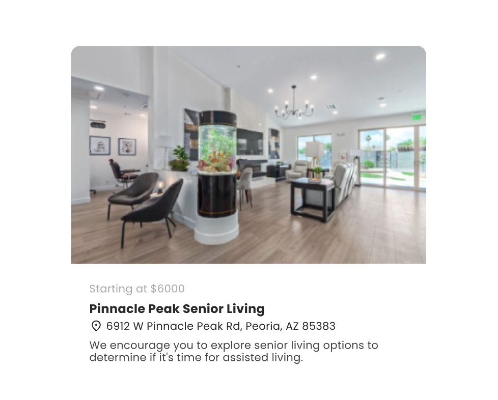
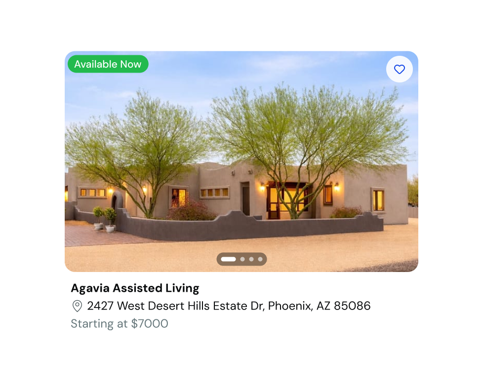
The home card shows what differs
The old card gave its widest line to marketing copy that read the same on every listing. It didn't say whether a home had space, showed one photo, and gave families no way to save a home. The new card leads with what separates one home from the next.
The agent dashboard is the listing
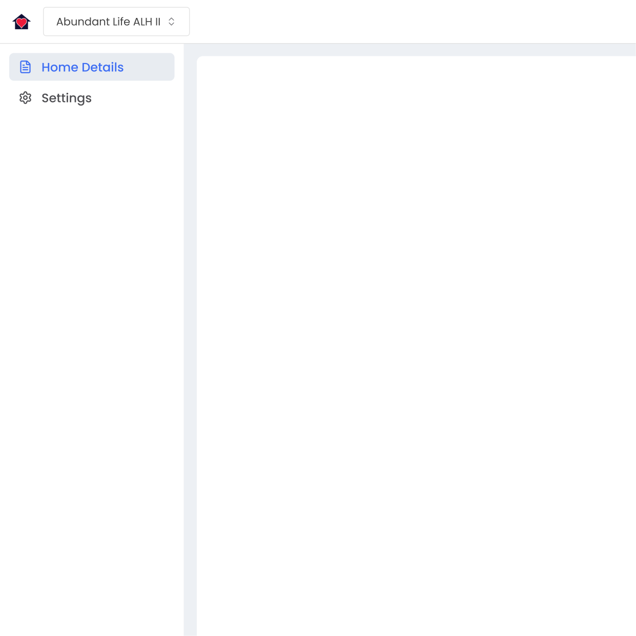
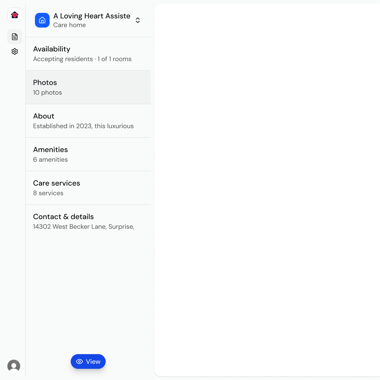
The old dashboard had two nav items and one long scroll, and many agents didn't reach the end. Now each section of the listing sits in the sidebar with its own state, so agents see what's thin before they open anything. That idea came from the Airbnb study.
Design system
Tokens
Each color goes from a raw value, to a primitive named for what it is, to a role named for its job. Components only ask for roles, and every role has a Figma variable with the same name.
Primitive
Named for what it is
Semantic
Named for the job
Figma
The same names, one to one
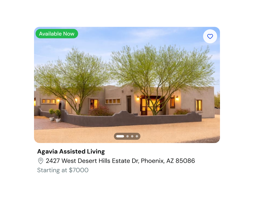
- 1
Availability badge
bg-alert-successtext-inverseradius-full - 2
Save control
bg-cardtext-brandsize-12 target - 3
Photo corner
radius-xlshadow-sm - 4
Carousel
bg-neutral-bold/60radius-full - 5
Home name
text-md · 18pxtext-primaryfont-bold - 6
Address
text-smtext-secondary - 7
Price
text-md · 18pxtext-tertiary
Components in Storybook
I build each component in Storybook first, in every state, at every size and at 200% zoom. A component is ready when it works outside both products. The library follows atomic design, so each new piece has to name its level.
The stack
| Tool | Layer | Why |
|---|---|---|
| Next.js | Framework | Server rendering, since much of the traffic is a phone on cell service. |
| React TypeScript | UI | TypeScript catches what I'd otherwise find in the browser. |
| Tailwind CSS | Styling | Tokens live as CSS variables, so a system change is one edit. |
| shadcn/ui | Components | I own the source, so I fix accessibility issues inside the component. |
| Figma | Design | Foundations and components, mapped one to one with the CSS variables. |
| Storybook | Components | Every component, in every state, before it lands in either product. |
| Vercel | Deployment | A preview build per branch, to check a change on a real phone. |
| GitHub | Version control | Design and code in one place. |
| Mobbin | Research | Search and discovery patterns from real estate marketplaces. |
| PostHog | Analytics | Funnels for search, compare and contact, and replays of where families stop. |
What's next
- 01The map.
One variant for home profiles, and one for map search.
- 02Better comparison.
Families decide on cost and care level side by side, and the product doesn't show that well yet.
- 03More editorial.
Resources and posts that answer what families ask before they tour.