
Design System Overhaul
- Company
- Proctorio
- Role
- Staff Designer, design system owner
- Team
- 2 front-end engineers
- Type
- Design System
- Design Systems
- Design Tokens
- Governance
- Accessibility
- Figma
- CSS
- Fewer card variants, 587 down to 32
- Fewer button variants, 1,160 down to 480
- Components rebuilt
- From start to MVP
I pitched a rebuild of a legacy design system and led it from the tokens up: 37 components, a 3-tier token architecture, WCAG AAA from the start, and its adoption into the products with intentional governance.
- 01TokensNamed for their job
- 02FoundationsWCAG AAA from the start
- 03Base componentsBuilt only from tokens
- 04Slotted componentsBuilt from the base
- 05RolloutOne product at a time
Started as a contributor
I contributed to Proctorio's original design system for two years. It had no formal owner, so every product designer shared the job of maintaining it. In those two years I saw firsthand how quickly component design can go from being a tool to being a bottleneck in the product lifecycle.
I also learned how much design and engineering need an efficient way to talk to each other, so designers aren't spending time and creative energy guessing what engineers actually need. Those lessons, and plenty of others, became the guiding principles for the overhaul and for the governance decisions that protect it.
Working inside the old system
- 01No semantic tokens.
Every gray had a name of its own, such as grey/graphite, and none said what it was for. A new shade had nowhere to go, no product could change its look without editing components, and every color choice meant looking one up.
- 02Product logic inside components.
Some components knew which product they were in. A component like that can't be reused, only copied.
- 03Variants for needs nobody had.
Hundreds of combinations had never been placed on a screen, and each one still had to be maintained.
- 04No shared names.
Three components called the same property three different things, so learning one taught you nothing about the next.
- 05Color never checked for contrast.
Accessibility was a review at the end of a project, when fixing it cost the most.
- 06Nobody deciding what belonged.
Anyone could add to the system, and nobody could say no.
- 07Bloated, looks-first documentation.
Designers wrote long handoff documents for every feature, polished to look good more than to be used. They were slow to write and slow to read, and they spelled out everything a well-built component would have shown on its own.
Pitching the rebuild
Patching would have kept every one of these problems. I pitched a full rebuild, and made the case together with our front-end lead, each of us speaking for our own discipline.
Design
What I argued
- Every product surface gets the same polished design language
- Designers stop spending time and energy rebuilding the same things
- Standards get set, and someone's job is keeping them
Engineering
What our front-end lead argued
- Every product pulls from one versioned library, so a fix lands everywhere at once instead of being copied by hand
- Components share Figma's names and are built from tokens, so engineers assemble screens instead of rebuilding parts
- Each component carries its own spec, so handoff documents shrink and ideas reach release sooner
Three rules
Once the overhaul was approved and I had mapped the pain points in the legacy system, I set three rules and held every component to them.
No product logic in components
If a component knows which product it is in, it isn't a system component. That knowledge belongs to the screen that uses it.
Build only for real use
An option or variant goes in when someone needs it on a screen. Nothing gets built for a need someone might have later.
Start from the system, and let it grow
Designers begin from the shared library, never a blank file. When a pattern keeps turning up in a product, it joins the system.
Pain point: No semantic tokens
The legacy color tokens had no meaning or standards behind them, so what designers and engineers used for what drifted apart. Should the error state of this text be red/ruby or red/crimson? Questions like that wasted time, and the guesses wore down design quality across surfaces.
The token architecture also made a theme-aware light and dark mode impossible for the products.
The card below is colored both ways. Under the old names, one shade colored unrelated parts, so no part could change on its own. The new tokens also move the grays from neutral to a slate.
I rebuilt the tokens before I touched a component. Every component takes its color, spacing and type from them, so fixing components first would have meant fixing them twice.
Each new token names a job. A button asks for the action color and gets whichever green the theme has set.
Our engineers build everything in-house, so I also wrote the CSS framework the tokens live in. It uses the same names as the Figma library, so designers and engineers describe the system in the same words.
Status colors
Status colors had it worse. The old palette had five reds and nothing saying which one meant an error, so designers and engineers each picked one that looked right. A single screen could show four different reds, and a field's border and its error message could disagree.
Now each meaning has one role, backed by its tokens: an error asks for danger, and danger decides the red. Success, warning and info work the same way, so a warning looks the same on every component and in every product.
Checked for contrast from the start
I set WCAG AAA as the standard and checked every color pair for contrast as I defined it, so the palette is accessible before anyone uses it. Every component carries an accessibility contract from its first version, and tests on our component documentation site check that it holds.
Pain point: Variants for needs nobody had
Components had grown unmanageably bloated, so I wanted only the use cases we actually had in the product to make it into the new version. I audited the design system in Figma and partnered with engineering to find where each component was actually used. The verdict:
- The system was doing more work now to avoid work later, fitting as much as possible into each component and everything it could do.
- Components like cards and modals didn't use slots, which led to wild combinations of variants, props and booleans.
- Engineers struggled to make the system work for them, so they built their own components as bandaid fixes, and design and engineering had no consistent language between them.
The card had 587 variants because designers had no way to build a new card from parts. Each time someone needed one, they added a variant, and every new need became one more on/off option. Options multiply: ten of them allow over a thousand cards.
- hasIcon: boolean
- hasBadge: boolean
- hasFooter: boolean
- isCompact: boolean
- isElevated: boolean
- isSelectable: boolean
- showsMeta: boolean
- reportVariant: booleanproduct logic
- inboxVariant: booleanproduct logic
- adminVariant: booleanproduct logic
20
1
possible cards
One shared language
When I rebuilt the base components, I set one standard language for components and tokens, shared by the Figma library and the codebase. Engineers rarely had to follow up to ask what a design meant.
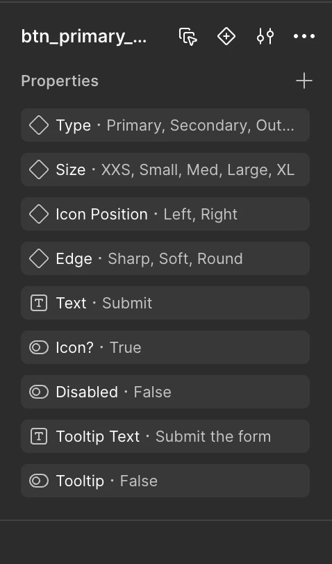
The old library had no naming rules, so each component used whatever its builder chose. Button's sizes ran XXS to XL, Input's were S, M and L, and Card's was Compact. Button's Type held everything at once, so Primary, Outline, Danger and Danger Outline sat in one list. Disabled was an on/off option on one component and a state on another. Status colors were named by hue on some components and by meaning on others, so Red, Error and Danger all meant the same thing.
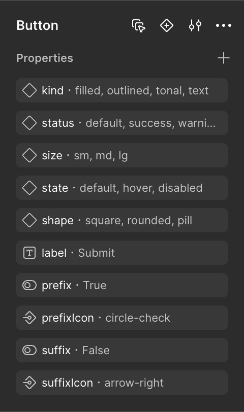
I gave every component the same property names:
sizeon one scale, andstatefor hover, focus and disabled.statusfor meaning: success, warning, danger or info, the same on every component.- On Button,
kindfor how it's drawn: filled, outlined, tonal or text, andshapefor its corners: square, rounded or pill, which the old Button called Edge. Kind and status are separate, so a danger button can be any kind. prefixandsuffixfor an icon before or after the text, andlabelfor the text itself, on every component that has them.
A designer who knows Button's properties already knows Input's.
Slots
I worked with our engineer to bring slots into our components: open areas a designer fills with whatever the screen needs. Slots gave the design team the flexibility it had been asking for without creating massive components. Two concerns came up.
How do slots work in Figma? This was before Figma released its own slot feature. I made a slot component to place inside something like a card, with an instance swap property attached, so designers could swap in a component from their own project or another one from the design system.
If anything can go in a slot, how do designers stay consistent? For every component that uses slots, I made preferred-value components. A base component called Modal actions, for example, holds every variant of how a modal's actions can appear, with those properties nested.
Designers got the freedom to put a new design inside an existing component while staying consistent with little effort, and engineers got leaner code.
Escalated
Last 7 days
14
Room scan
Failures by cause
Integrity review
3 sessions flagged
Each slot lists its preferred parts, and anything else gets flagged. A modal's body takes text, media or an input; its footer takes a set of actions or a single button. The old modal did the same job with 22 on/off options, each named by whoever added it.
Lean machine results
| Component | Before | After | Change |
|---|---|---|---|
| Button | 1,160 | 480 | −59% |
| Card | 587 | 32 | −94% |
Card
587 → 32
Button
1,160 → 480
Simplifying handoffs
I replaced our original documentation approach with a lean single-page doc that sits beside every component in the Figma library, plus a simple usage guide for designers. Our front-end engineers collaborated with me in Figma, and Figma stayed the source of truth for how things should look.
Governance and sustainability
Product surfaces moved to the new system one at a time, and product work went on while they did. Each surface had to be redesigned to fit, and teams used that redesign to fix problems they had been living with.
Getting designers to adopt the system was a part of the work I enjoyed. With the right setup, designers no longer had to detach components to make them work in their designs. The cases that did come up were often a designer feeling that a component's styling or feel didn't suit their use case.
A healthy, useful system has to be able to grow and change, because it only succeeds when people use it. That means staying open-minded enough to hear when a real change is the right move and when it isn't needed.
When a designer hit one of these cases, I'd ask them to show me a version of the component they felt fit their design, overriding it however they wanted. Then I judged it case by case:
- Does it fit our design language?
- Could this style fit anywhere else in the product?
- If it fits, should it be a new variant, or should we update the current styling, as long as that doesn't break anything?
- Do we have time for this change?
Other times a designer was using a component for something it wasn't designed for. If they didn't know, I showed them why and how to use it. If they didn't like the component, we went back to those questions.
What changed
- The new Card shipped in 1.5 days. The old one took 2 weeks.
- 37 components rebuilt, with a working first version in 60 days.
- Card variants fell from 587 to 32, and button variants from 1,160 to 480.
- Three product suites now share one visual language, because they all build from the same base.
- Handoff documents shrank to what components can't say for themselves. What was left became the starting point for the agentic handoff pipeline, which cut spec writing from days to minutes.
What I'd do next
- Connect the Figma components to their code with Code Connect, so designers see the real component instead of a description of it.
- Put the three rules inside the library, so they arrive with the components.
- Track adoption, so I can measure how much the system is used instead of guessing.