
storybook-kit
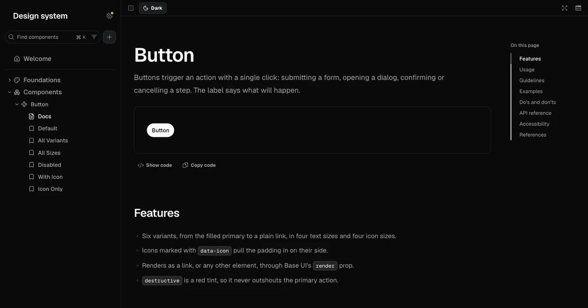
Storybook's default interface is built for engineers. Designers who now build components with an AI agent end up with a library that works but looks like a developer tool, and paid documentation tools document pictures of components rather than the components themselves.
fibo's Storybook already solved the look. storybook-kit lifts that shell out, makes it configurable, and wraps it in skills so the agent does the setup.
Who it is for
Product designers looking to build out a Figma design system, or the components for a project.
What is in it
storybook-kit
A Storybook for your design system that looks like it was made by a designer.
storybook-kit is a pre-styled Storybook template, a getting-started guide, and a set of agent skills that take you from a Figma file to a documented, shareable component library. It is for designers who build with an AI agent (Claude Code or Cursor) and would rather not learn Storybook's internals to get there.
Status: early. The shell is in
template/and the guide is indocs/getting-started.md. The skills are next. Seeplans/001-brief.md.
What is in it
- The shell. A Storybook with a calm, designer-facing interface: a clean sidebar, light and dark themes, and docs pages for anatomy, usage and do/don't. You change the name, logo, fonts and colours in one file.
- The guide. Every step from an empty laptop to a running Storybook, written for people who have not opened a terminal before.
- The skills. Instructions your agent follows to set the kit up, pull tokens from Figma variables, turn a Figma frame into a documented component, and publish the result as a link.
Credits
The shell started life in fibo.
Getting started
This guide takes you from an empty laptop to your own Storybook running in a browser tab, with your name, fonts and colours on it. You don't need to have used a terminal before. Plan on about 15 minutes, most of it waiting for downloads.
You'll need a Mac or a Windows computer and an internet connection. A Figma file is useful later but not for this guide.
1. Install Node.js
Node.js is the program that runs Storybook on your computer. You install it once and then forget about it.
- Go to nodejs.org and download the LTS version (24 at the time of writing).
- Open the file you downloaded and click through the installer with the default options.
To check it worked, open a terminal:
- On a Mac, press Cmd+Space, type
Terminal, and press Return. - On Windows, open the Start menu, type
PowerShell, and press Enter.
Type this and press Return:
node -vYou should see a version number that starts with v24. If you see "command
not found" instead, close the terminal, open a new one, and try again. The
installer only reaches terminals opened after it finished.
2. Install an agent
The kit is built to be set up and extended by an AI agent. Pick one:
- Cursor is a code editor with an agent built in. It's the easier start if you like having windows and buttons.
- Claude Code runs in the terminal you just opened.
Either works with everything in this guide.
3. Get the kit
- Go to github.com/toribryan/storybook-kit.
- Click the green Code button, then Download ZIP.
- Unzip it. Inside you'll find a folder called
template. - Move
templateto wherever you keep your projects and rename it after your design system, for exampleacme-design-system.
That folder is your project from now on. You can delete the rest of the download.
4. Open the project
In Cursor, choose File, then Open Folder, and pick your project folder. Then open the built-in terminal with View, then Terminal.
In a regular terminal, type cd followed by a space, drag your project
folder onto the terminal window, and press Return. The terminal is now
"inside" your project, and commands you type apply to it.
5. Start Storybook
Type these two commands, pressing Return after each one:
npm install
npm run storybook
The first downloads everything the kit depends on. It takes a minute or two and prints a lot of text; that's normal. The second starts Storybook and opens it in your browser. If no tab opens, go to localhost:6006 yourself.
Storybook keeps running for as long as the terminal stays open. To stop it, click in the terminal and press Ctrl+C (on a Mac too, not Cmd).
6. Make it yours
Open brand.config.ts in your project folder. It's the only file you need to
touch to change how the Storybook looks, and every setting in it has a note
explaining what it does.
nameis shown at the top of the sidebar and in the browser tab.logois an image you put in thepublicfolder, written as"/logo.svg". Leave it empty to show the name as text instead.fontstakes the names of your fonts and a Google Fonts link that loads them. On fonts.google.com, pick your fonts, click Get embed code, and copy the address from thehrefpart of the link.chromesets the colours of the sidebar and toolbar, once for light mode and once for dark.
Save the file. The docs pages update straight away. The sidebar and toolbar
only pick up changes when Storybook starts, so press Ctrl+C in the terminal
and run npm run storybook again.
7. Add your colours
Your components' colours live in src/styles/globals.css, as named tokens
such as --primary and --border. Each token is set once in the :root
block for light mode and once in the .dark block for dark mode. Change a
value there and every component that uses it follows. The Colors page in
Storybook reads this file directly, so it always shows what you have.
Keep the token names the same as your Figma variables. That way a designer reading Figma and a developer reading the code are talking about the same thing.
8. Add a component
Every component is three files in src/components. Button is there as an
example:
| File | What it is |
|---|---|
button.tsx | The component itself |
button.stories.tsx | The versions of it Storybook shows: each variant, size, state |
button.mdx | Its docs page: usage, guidelines, do's and don'ts |
To add your own, ask your agent. Give it the link to the Figma frame and say which component it is, for example: "Add a Badge component from this Figma frame, with stories and a docs page like Button's." Point it at Button so it follows the same pattern.
9. Share it
When you want other people to see your Storybook, run:
npm run buildThis makes a folder called storybook-static in your project. It's a
complete website. To put it online, go to
Vercel Drop and drag the folder onto the page. You
get a link you can send to anyone.
If something goes wrong
"command not found: npm" means Node.js isn't installed, or the terminal was open before you installed it. Open a new terminal and try again.
"Port 6006 is in use" means Storybook is already running somewhere, probably in another terminal window. Close that window, or use the tab that's already open.
If you changed brand.config.ts and the sidebar looks the same, stop
Storybook with Ctrl+C and start it again with npm run storybook.
If a page shows a red error box, copy the whole message and paste it to your agent. It can read the error and fix the file that caused it.
001: Brief
What
A public repo with three parts:
- The shell, a Storybook template styled for designers.
- The guide, a getting-started walkthrough that assumes no development experience.
- The skills, agent instructions that set the kit up and fill it from Figma.
Why
Storybook's default interface is built for engineers. Designers who now build components with an agent end up with a component library that works but looks like a developer tool, and paid documentation tools (zeroheight, Supernova) document pictures of components, not the components themselves.
fibo's Storybook already solves the look. This project extracts that shell, makes it configurable, and wraps it in skills so the agent does the setup.
Who
A designer with a Figma file, Claude Code or Cursor, and little development experience. The agent is their interface: they will ask it to "set up a Storybook from my Figma file", not run commands themselves.
The shell
Taken from fibo's apps/storybook/.storybook and src/blocks:
| From fibo | Becomes |
|---|---|
theme.ts (hand-copied hex) | A manager theme generated from brand.config.ts |
manager-head.html sidebar CSS | The same, with fibo's colours swapped for variables |
manager.tsx icons, status pills | The same, icon map driven by config |
theme-sync.ts, preview.tsx | Light and dark toggle, as is |
docs-container.tsx, typography.tsx | Docs page layout and MDX typography |
anatomy, guidelines, data-attributes blocks | Docs blocks |
Stays in fibo: the welcome page, hero, pixel grid, sounds and the snail.
New for the kit:
brand.config.ts: name, logo, fonts, accent. The only file a designer edits.- Foundations pages (colour, type, spacing, radius) that render from the token CSS, so they update when tokens change.
- Page templates: Welcome, Getting started, Changelog.
The skills
| Skill | Does |
|---|---|
setup | Scaffolds the template, installs, asks for name and logo, starts Storybook |
sync-tokens | Reads Figma variables through the Figma MCP, writes the token CSS |
add-component | Figma frame URL in; component, stories and docs page out |
document | Writes usage and do/don't guidance in plain language |
review | Checks token use, accessibility and missing states |
publish | Deploys to Vercel or Chromatic and returns a link |
upgrade | Bumps Storybook and repairs any sidebar selectors that broke |
Version 1
The shell, the guide, and three skills: setup, sync-tokens,
add-component.
Done when a designer who has never used Storybook goes from nothing to one Figma component documented in the kit, without help, in about ten minutes. Watch one do it; where they stall is version 2.
Decisions
- One stack: React, Vite, Tailwind CSS 4, Storybook 10. Supporting every framework conflicts with "minimal development knowledge". The shell's chrome is framework-agnostic, so a later skill could restyle an existing Storybook.
- Storybook pinned exactly. The sidebar styling targets Storybook's
internal class names and IDs. The
upgradeskill is how version bumps happen. - Skills in
.agents/skills/, linked from.claude/skills/, written without tool-specific instructions so Claude Code and Cursor can both run them. - Separate repo, not a fibo package. fibo stays a design system; this is a tool for making one.
Open questions
- How Cursor discovers skills in a project, and whether it needs its own link
alongside
.claude/skills/. Verify before writing the first skill. - Distribution: a GitHub template repo,
npm create storybook-kit(the name is free on npm), or both. - Component base: Base UI like fibo, or plain components with no primitives library.
- Licence. MIT is the default for this kind of project.
- Whether "storybook-kit" reads as an official Storybook product. Storybook's name is theirs; the README should say this is an independent project.
Where it is
The shell is extracted from fibo into the template, and the getting-started
guide is written. Next are the first three skills: setup, sync-tokens and
add-component. Version one is done when a designer who has never used
Storybook goes from nothing to one Figma component documented in the kit,
without help, in about ten minutes.
storybook-kit is an independent project and is not affiliated with Storybook.