Real Wedding Submissions
- Company
- Iron Diamond Media
- Reach
- Seven sister bridal publications
- Role
- Product design + front-end build
- Type
- Product Redesign
- Research
- FigJam
- UX Writing
- React
- TypeScript
- Base UI
- View Transitions
- Claude Code
A submission wizard that replaces a fillable PDF, a shared inbox and a color-coded spreadsheet for Iron Diamond Media's seven bridal publications.
Problem
Real weddings reached the magazine through a fillable PDF downloaded from SharePoint, emailed to a shared inbox, and tracked in a color-coded Excel sheet. Staff unpacked gallery links by hand and chased submitters for whatever was missing. A national site launching in early 2027 would multiply the volume.
Task
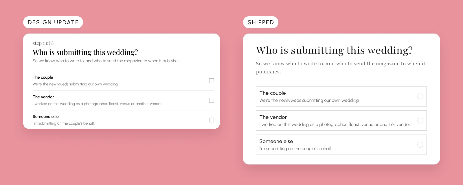
Turn the engineer's nine-step shell and data requirements into a submission flow that collects what editorial actually needs, in words the editors wrote, on the shared design system.
Process
Audited the editors' feedback thread against the shipped shell, wrote a copy deck from it, mapped three submitter journeys in FigJam, prototyped the revised flow at low fidelity with AI, then swapped in the design system and built the front end with coding agents.

Where this starts
Iron Diamond Media publishes seven bridal magazines, and every real wedding they print starts as a submission. Before this, that meant a fillable PDF from SharePoint, emailed to a shared inbox. Staff opened gallery links by hand, wrote back for whatever was missing, and tracked every submission in a color-coded Excel sheet. With a national site launching in early 2027, the number of submissions was about to grow past what that process could handle.
Reading the editors against the build
- 01Galleries.
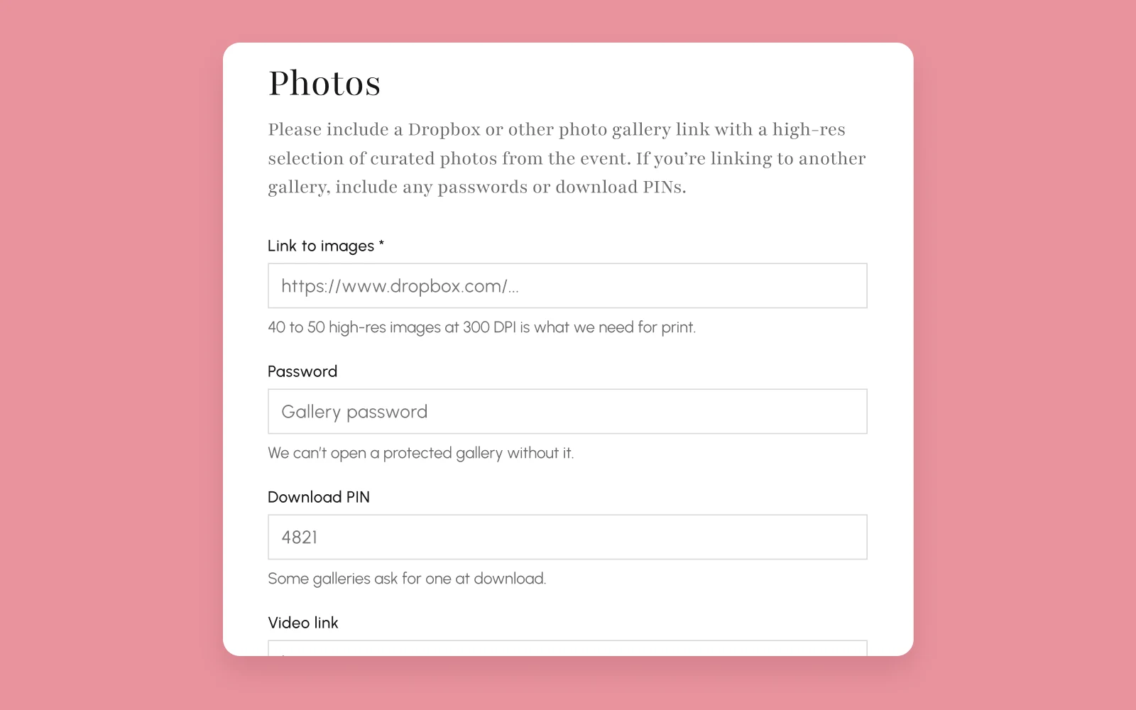
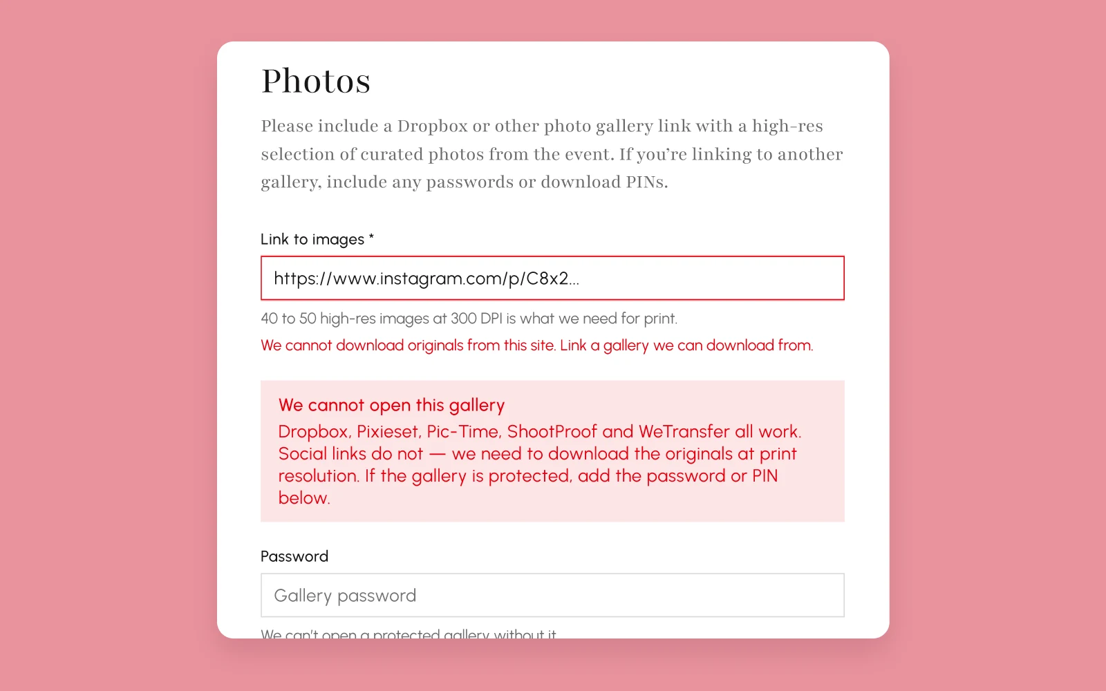
Both editors asked for "Dropbox or other photo gallery" links. The validator only accepted dropbox.com, so a Pixieset or Pic-Time gallery failed with "Enter a valid Dropbox link."
- 02Instagram.
The editors settled on mandatory, with "N/A" as the escape hatch. The handle pattern rejected N/A.
- 03Addresses.
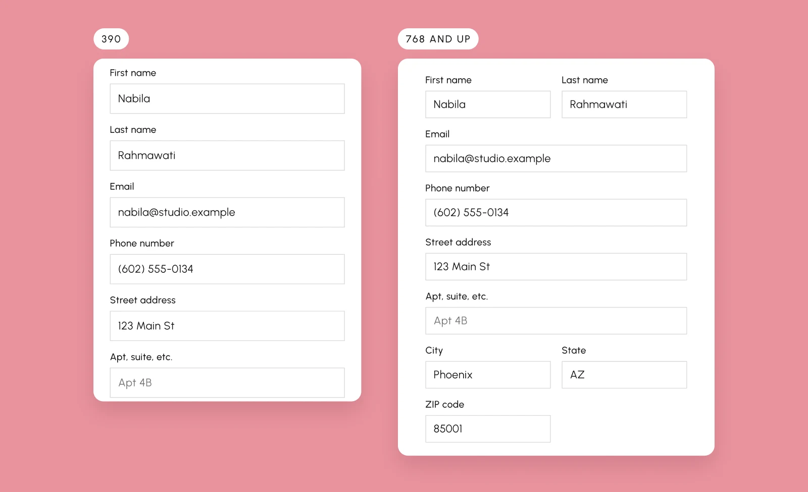
The editors wanted the submitter's address required and the couple's optional, since they collect it during factcheck. The build had it backwards.
The flow
Vendor9 steps
YouCoupleEventPhotographerPhotosStoryVendors
Photographer9 steps
PhotographerYouCoupleEventPhotosStoryVendors
Couple8 steps
You and your partnerEventPhotographerPhotosStoryVendors
Someone else9 steps
You + relationshipCoupleEventPhotographerPhotosStoryVendors
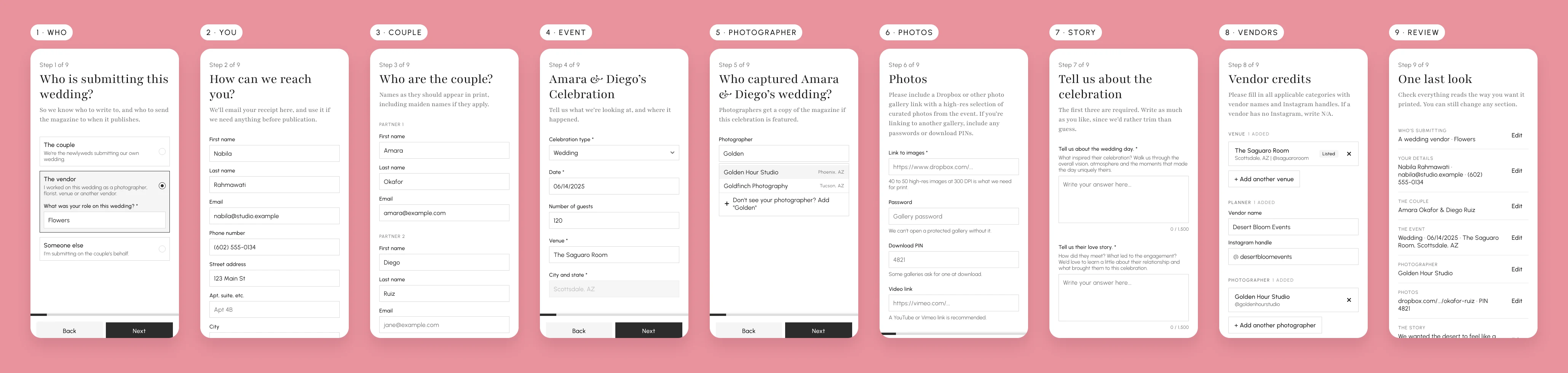
The publications step was the one I removed. A submission belongs to the publication whose site you started on, so the form reads the brand from the host instead of asking for it.
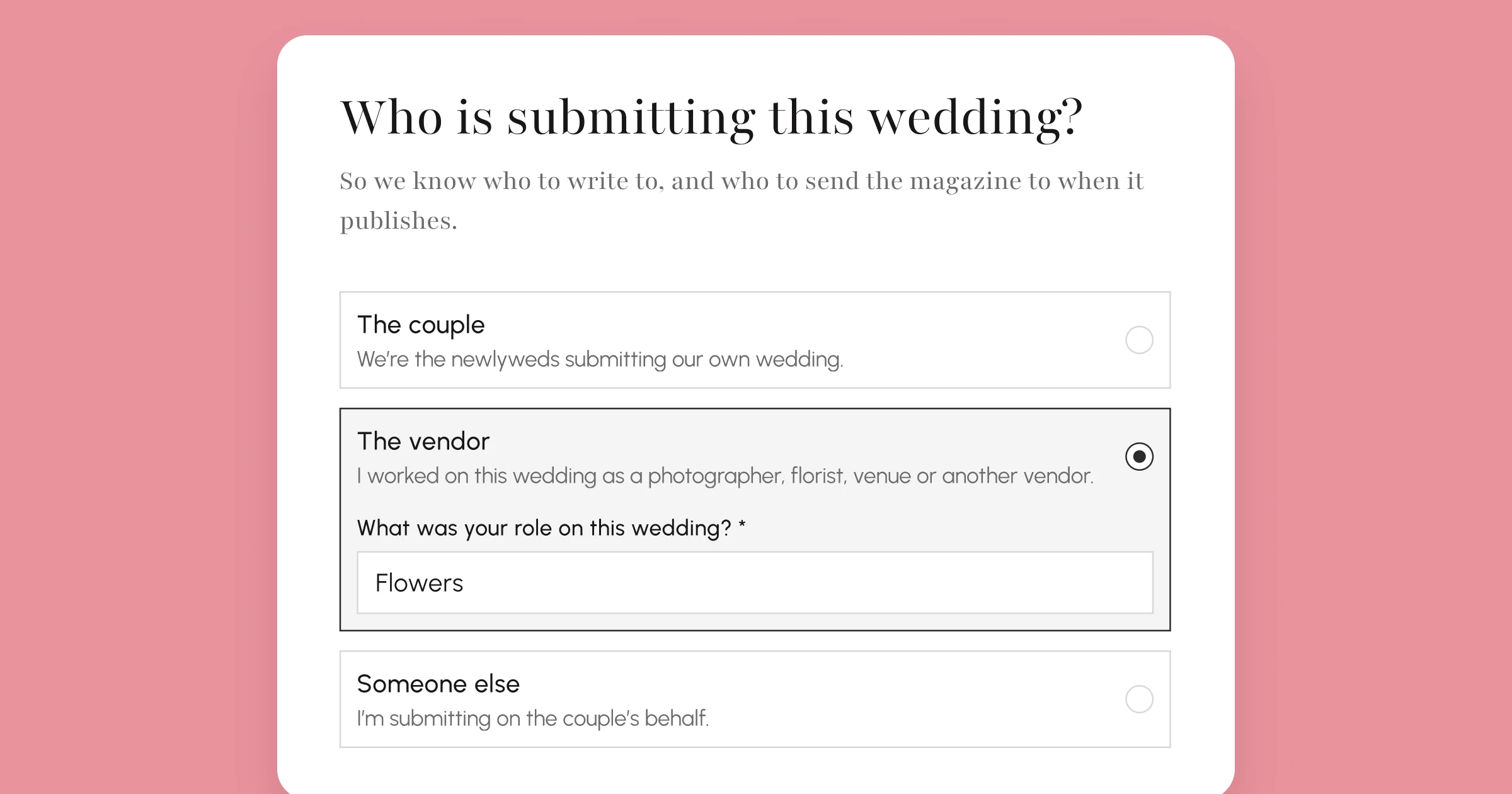
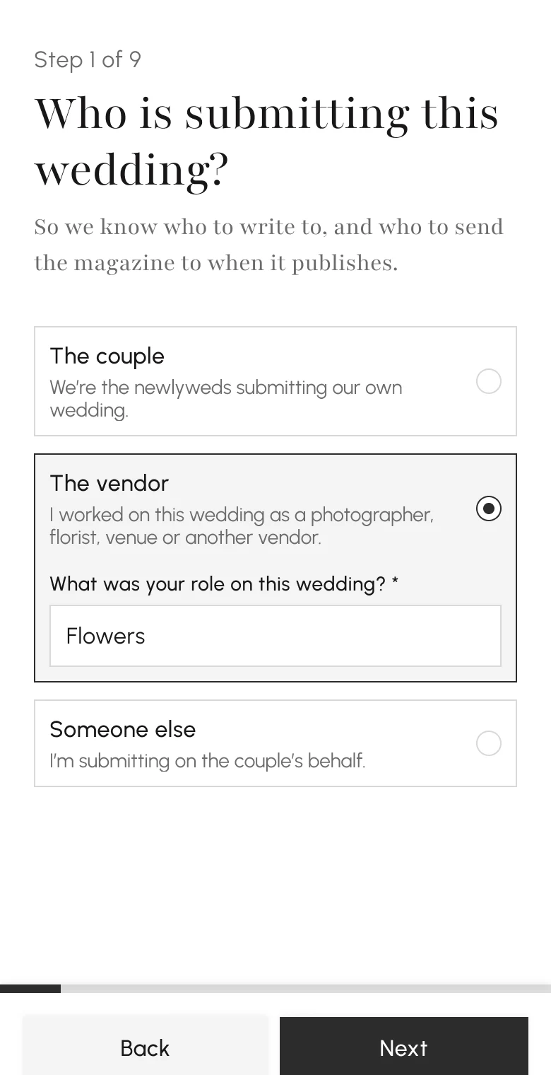
"The photographer" option became "The vendor". A vendor picks their role inside the same card, because the magazine mails copies to the submitter, the photographer and the couple, and it needs to know which one you are. A photographer gets their own step first. Everyone else gives their details, then names the photographer.
Vendor credits are sorted by category: venue, planner, photographer, videographer and florist come pre-filled, and each one has its own search. Adding a category opens the picker with focus already in it, and choosing a category opens its search. If nothing is listed under that category, the form goes straight to the fields for entering a vendor by hand.
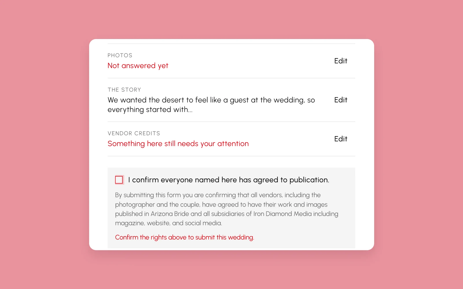
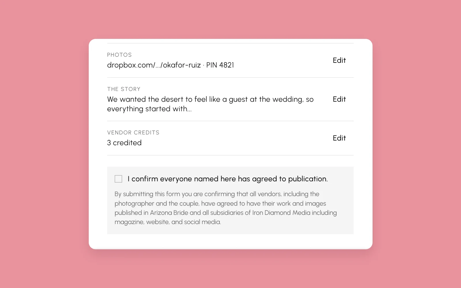
The review step the shell never had shows each section on its own row with an Edit link, says how many things still need attention, and ends on the consent line editorial required: "I confirm everyone named here has agreed to publication."
Every page
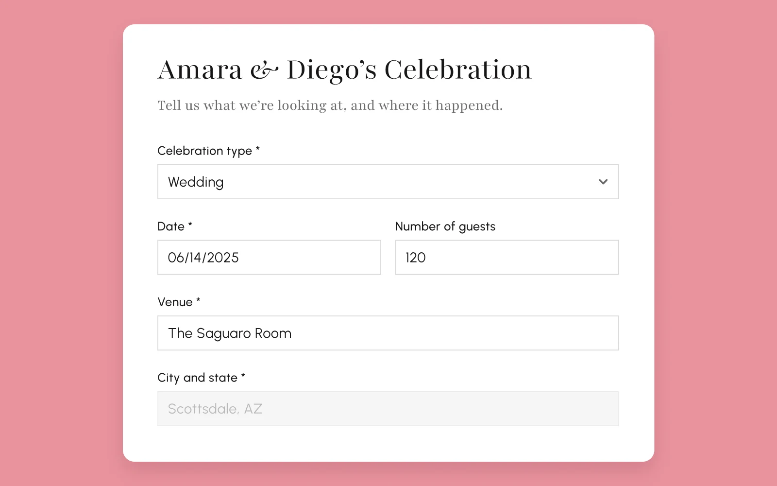
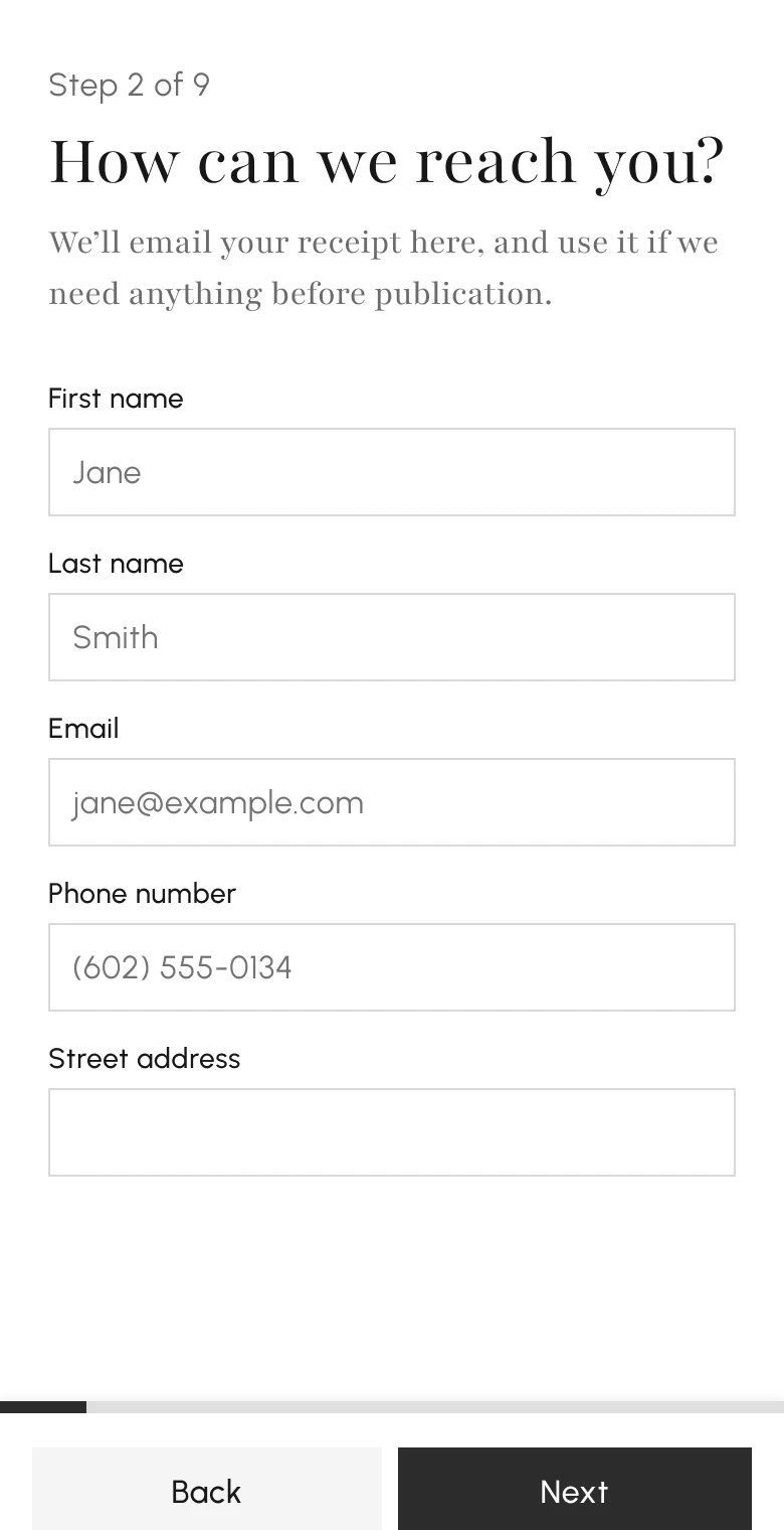
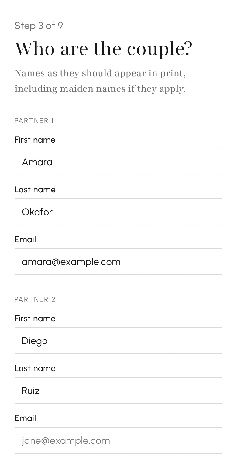
Each step as it shipped, at desktop width with the header and footer in place, in the order a vendor sees them. Open any page to flip through them all.
How it moves
Each step change runs as a React <ViewTransition> with forward and back
types. The step that's leaving fades out fast and the next one fades in more
slowly, so the old content gets out of the way before the new content
arrives.



--motion-exit-duration: 150ms;
--motion-enter-duration: 210ms;
--motion-move-duration: 400ms;
--motion-credit-duration: 480ms;
--motion-credit-ease: cubic-bezier(0.22, 1, 0.36, 1);
Loading states are shaped like the step they stand in for, and the app-wide skeleton changed from a pulse to a sheen. With reduced motion on, every transition runs at zero duration, the sheen stops, and scrolling a new vendor category into view jumps there instantly.
How I worked
I researched competitors and talked with the digital editors, then used what I learned to map the journeys in FigJam. I used AI to prototype a low-fidelity version of the revised flow. In a second pass I swapped the design system in for everything, and my coding agents helped implement the design on it.
Handing it to engineering
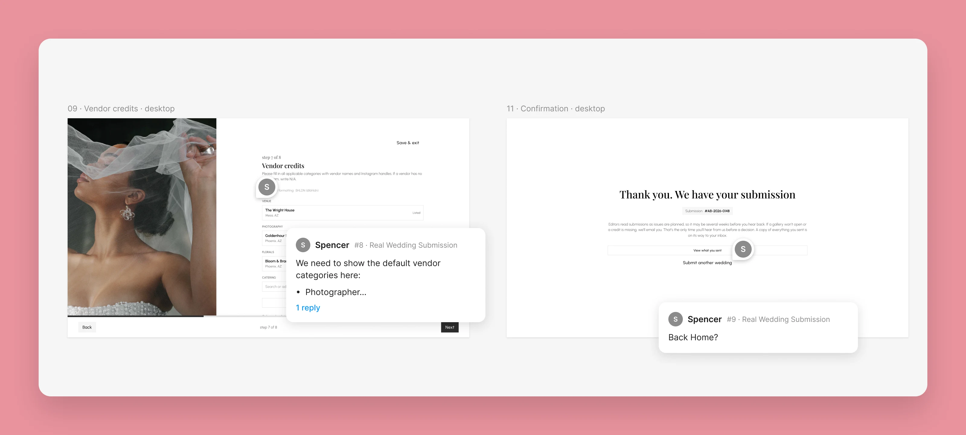
My branch came to 73 files. The engineer split it into a stack of eleven PRs, each under about a thousand lines and reviewable on its own, and merged it in order. The engineer refactored it afterward: the step model became explicit per-persona orders, the photographer step became a single search with inline email and Instagram fields, and the image rail and some "(optional)" labels came back.