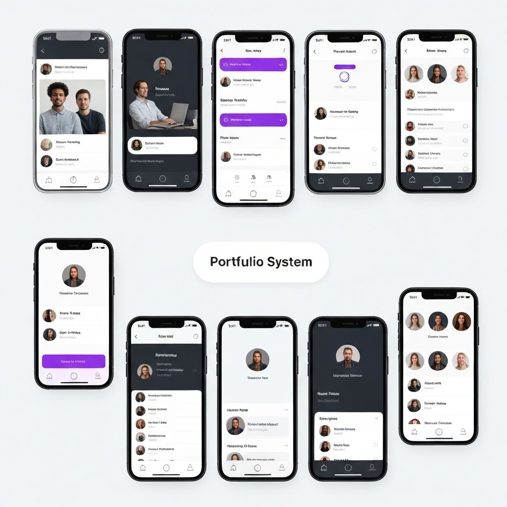
Pulse Mobile System
Designed a mobile-first design system for a health tech platform. Created adaptive components that scale across phone and tablet, with a semantic color system supporting light, dark, and high-contrast modes.
Role
Lead Product Designer
Timeline
Jan 2025 - May 2025
Team
2 Designers, 2 iOS Engineers, 2 Android Engineers
Impact
3 themes / 200k+ users / 45 components
Overview
Wellspring Health needed a cohesive mobile design system that worked across iOS and Android while supporting accessibility-critical features like high-contrast mode and dynamic type. Pulse was designed mobile-first from the ground up, prioritizing touch ergonomics and health data visualization patterns.
The Problem
The iOS and Android apps had diverged significantly in visual language and interaction patterns. Users switching between devices had a jarring experience. The health data visualizations were inconsistent, and the app failed accessibility standards required for healthcare compliance.
Process
Project Phases
Platform Audit
2 weeksDocumented every screen in both the iOS and Android apps, mapping divergences in layout, component usage, interaction patterns, and accessibility compliance.
Deliverables
Semantic Color System
3 weeksDesigned a semantic color architecture with three modes: light, dark, and high-contrast. Every color decision maps to a semantic role (e.g., surface.primary, text.critical) rather than a raw value.
Deliverables
Adaptive Components
6 weeksBuilt 45 components that adapt to screen size, orientation, and accessibility settings. Touch targets meet 48dp minimum, and all components support VoiceOver/TalkBack natively.
Deliverables
Health Data Patterns
3 weeksCreated a specialized set of data visualization components for health metrics - charts, trend indicators, and status badges - all designed for glanceability on small screens.
Deliverables
Results
Outcomes
3
Theme modes (light, dark, high-contrast)
200k+
Users on the unified system
45
Cross-platform adaptive components
100%
Healthcare accessibility compliance
Reflection
"Mobile design systems force you to be ruthlessly economical. Every pixel of space and every millisecond of interaction matters. High-contrast mode turned out to be the feature that earned the most user trust."