
Design Engineering a Portfolio
- Next.js
- Storybook
- shadcn/ui
- Claude Code
I redesigned my portfolio, learned a new stack, and tried a handful of new tools along the way. Here's what stuck, what didn't, and why.
Framer

I started my first portfolio redesign as a Framer site, coming from a background of working in Webflow. Despite my doubts about "no code" web platforms in general, Framer is good for what it's built for. The move from Webflow was easy, and it has a great canvas editing view, something a lot of designers crave. The CMS is really nice too, and I see the value in it as a product. It just wasn't the right fit for me.
I struggled with a mix of components, some built on the Framer canvas and some written as code by Framer's agent. Editing the code components inside Framer didn't work as easily as I wanted, and that got frustrating fast. Sometimes it rendered my canvas design when I wanted the code component, and once I finally had the code component showing, I'd be fighting to get back to the canvas version. I needed more control than the platform wanted to give me.
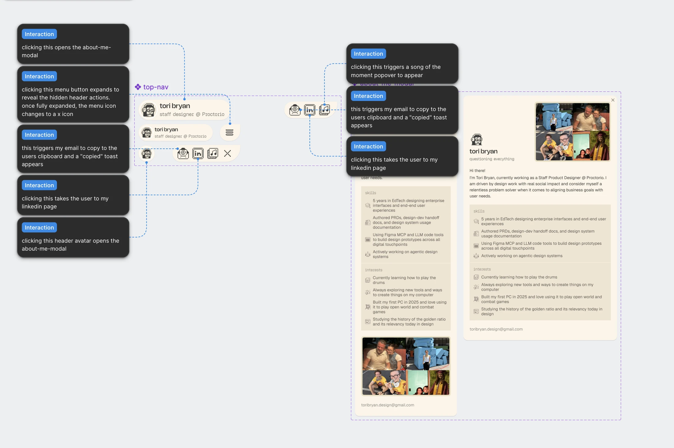
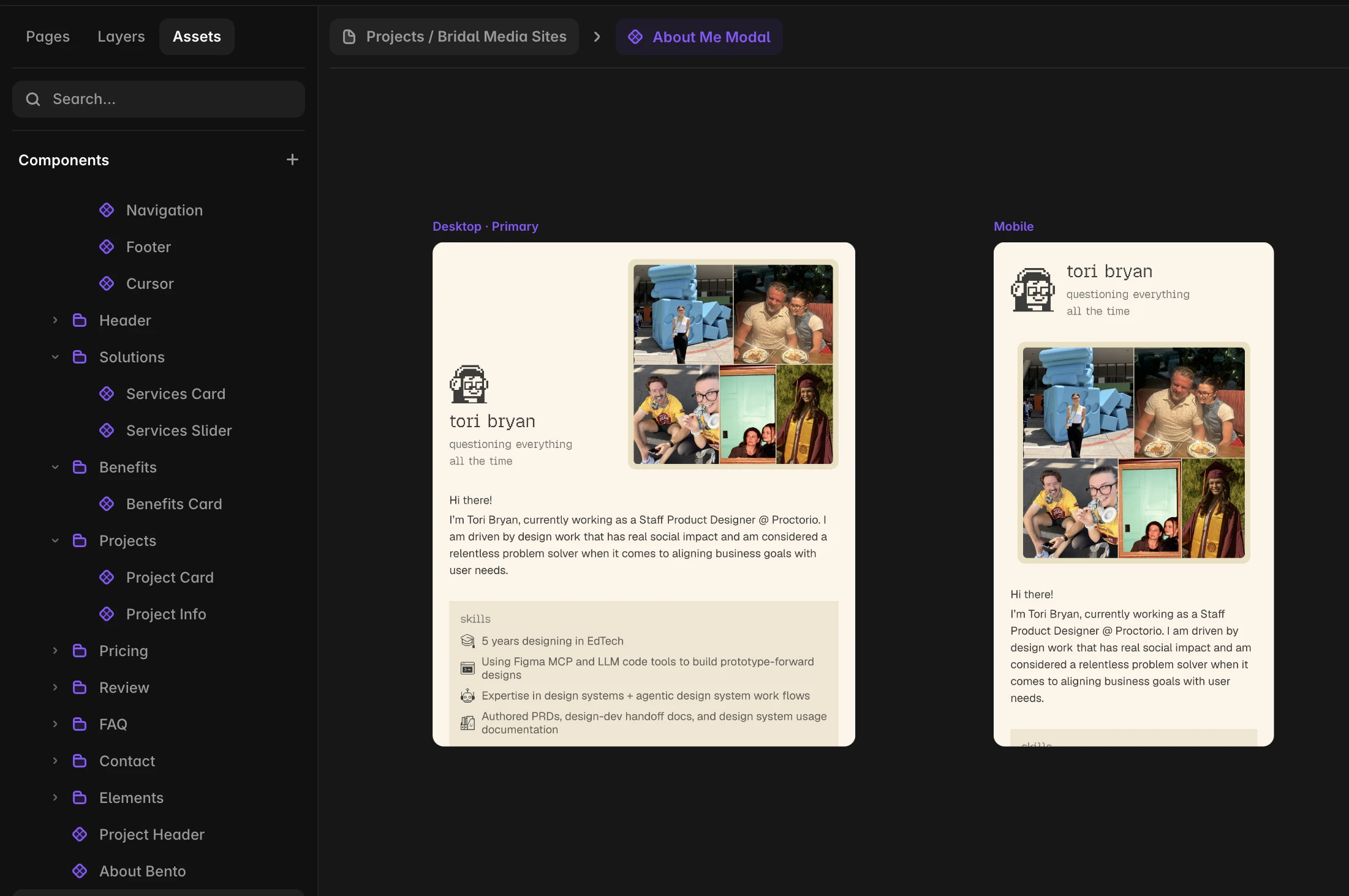
A second concept, for the about-me modal, went the other way: designed in Figma first, then rebuilt in Framer by hand. That order was easier for me, but Framer has no clean way to bring a Figma design over, which was a bummer.
Astro and Cloudflare
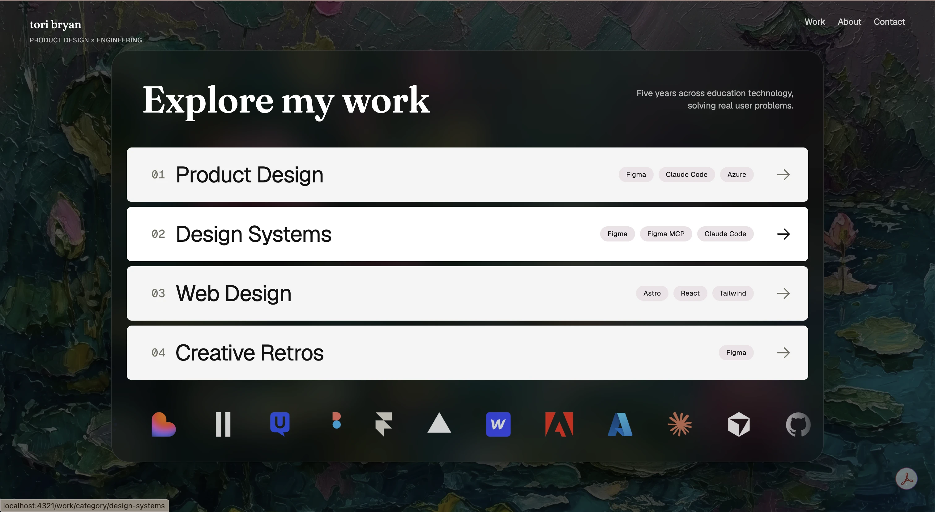
Astro gave me the flexibility Framer didn't, right away, and it was great for building the static pages of my site. It felt easy to work with, and it let me lean into React and actually strengthen my animation and bezier skills instead of working around a tool.
Next.js
When I was exploring other Design Engineer portfolios, I noticed many of them were Next.js apps, and I wondered why. My vague understanding after some research: more server-side rendering, faster, better for SEO. So I adopted it for my new portfolio.
No regrets. Next.js has been pretty intuitive, and learning it alongside a deeper dive into React has been smooth. I wouldn't say easy, but I haven't hit any real friction understanding how it all fits together. Big fan, and this site runs on it now.
Storybook

Storybook is a great tool for building out a design system from Figma, and the components for a project. I build every component there first, in isolation, in each of its states and variants, before it lands on a page. That makes it easy to check the coded version against the Figma library part by part.
It's where fibo's components live, and where I built the components for Modern Care Homes before they shipped in either product.
The rapid-fire reviews
The places I've worked self-hosted everything for security reasons, so I never got to experiment with the big-name platforms. This rebuild was my chance. Here's every one I tried, pros and cons.
WebStorm
My go-to IDE now. My engineer boyfriend recommended it, and after drifting back to VS Code for a while, I came back to WebStorm and stayed.
- Pros: Feels more modern and mature than VS Code, and everything I need is built in rather than bolted on with extensions.
- Cons: Unfamiliar at first, which mattered while I was already learning so much at once.
My go-to terminal app.
- Pros: As a designer I love how elevated the UI feels, and personalizing it is simple: one plain config file for themes, fonts and the rest, no settings maze.
- Cons: None yet.

My favorite new find right now. I became a member and I'll be posting my own component designs there.
- Pros: The best marketplace for design engineering components I've found. Beautifully crafted work, and a place to publish your own as a member.
- Cons: Some components look better than they're engineered, with way too many effects. Fine, but worth knowing.
- Pros: Loved it. It's a really good starting kit that lets you turn your own design system into real code without reinventing every UI primitive. It handles the hard parts of UI while leaving a lot of flexibility in the visual design. I've almost always designed products from systems I built myself, and I liked that it didn't lock me into someone else's design system.
- Cons: None yet.

I've been playing with this one for four or five months. More recently I used it to explore my new portfolio design language, and alongside shadcn themes when ideating the design system for my dashboard project.
- Pros: A real Figma alternative for design system building. You see your system live as you build it, and there's a Subframe MCP.
- Cons: No variables, so it can't handle complex token architectures. If you're building one of those, stay in Figma.

My best friend right now. Daily notes, task outlines and skill-building plans all live here. I'm considering building a map of content (MOC), or "Second Brain," in it.
- Pros: Fits how I actually work day to day with little to no friction.
- Cons: The title doubles as the file name, which is annoying.

- Pros: Genuinely good databases and knowledge bases. It's where my career index and project KBs live.
- Cons: I don't work in it day to day right now, so I only keep info in there that won't go stale.
snd.dev
A little platform with three UI sound libraries made by UX developers. I downloaded Sine, but Industrial and Piano are awesome too.
- Pros: The sounds are semantic, mapped to real states: disabled, notification, tap, swipe, toggle on, toggle off, celebration.
- Cons: Easy to overdo. I'll only use one or two, because a sound on every element would be sensory overload. That's a restraint problem, not a product problem.

Marketed as a hub where you can vibe code an app, generate design assets, make interface sounds and generate images. I didn't really like it.
- Pros: Genuinely good for mood boarding. I fed it inspiration photos in a few styles for a floral painting background, and it blended them into generated ideas based on my board. The interface is also nicely designed.
- Cons: The rest of the pitch didn't land for me. I only used it for about two days, though, so weigh even the praise lightly.

I came here looking for a UI sound library.
- Pros: They have their own library, and a membership lets you modify sounds and mix in your own.
- Cons: Every marketplace preview plays at about 25 percent volume under a voiceover booming "ElevenLabs." I get that they're protecting their work, and I don't know how else they'd do it. But I came to hear the sounds before buying, and I couldn't hear the sounds. That killed it for me.

Where I drifted back to early in the rebuild, before WebStorm won me over.
- Pros: The classic. Familiar and dependable when everything else in my stack was new.
- Cons: I wouldn't say it's better than WebStorm, and it doesn't feel as modern.

- Pros: Really nice, no drama.
- Cons: None.
Where it landed
This site runs on Next.js and React, styled with Tailwind and deployed on Vercel. Its parts come from fibo, the design system I built on shadcn and Base UI and documented in Storybook. I build all of it with Claude Code, in WebStorm and Ghostty.