
Config 2026 Design Challenge

A 45-minute design-community sprint on Balance: one prompt, two states, two aesthetic arguments for what balance looks like.
Outcome
Two aesthetic directions, four takes: the interface itself became the argument.
- Company
- Design community challenge
- Role
- Solo participant
- Team
- Solo, each designer submitted independently
- Figma
Problem
Balance is a core design element, but you don't understand it until you have to defend it. The prompt: revisit one idea in two versions, one symmetric, one asymmetric.
The prompt
45 minutes. The core design element: Balance. Take one idea and build two versions of it, one symmetric, one asymmetric.
My approach
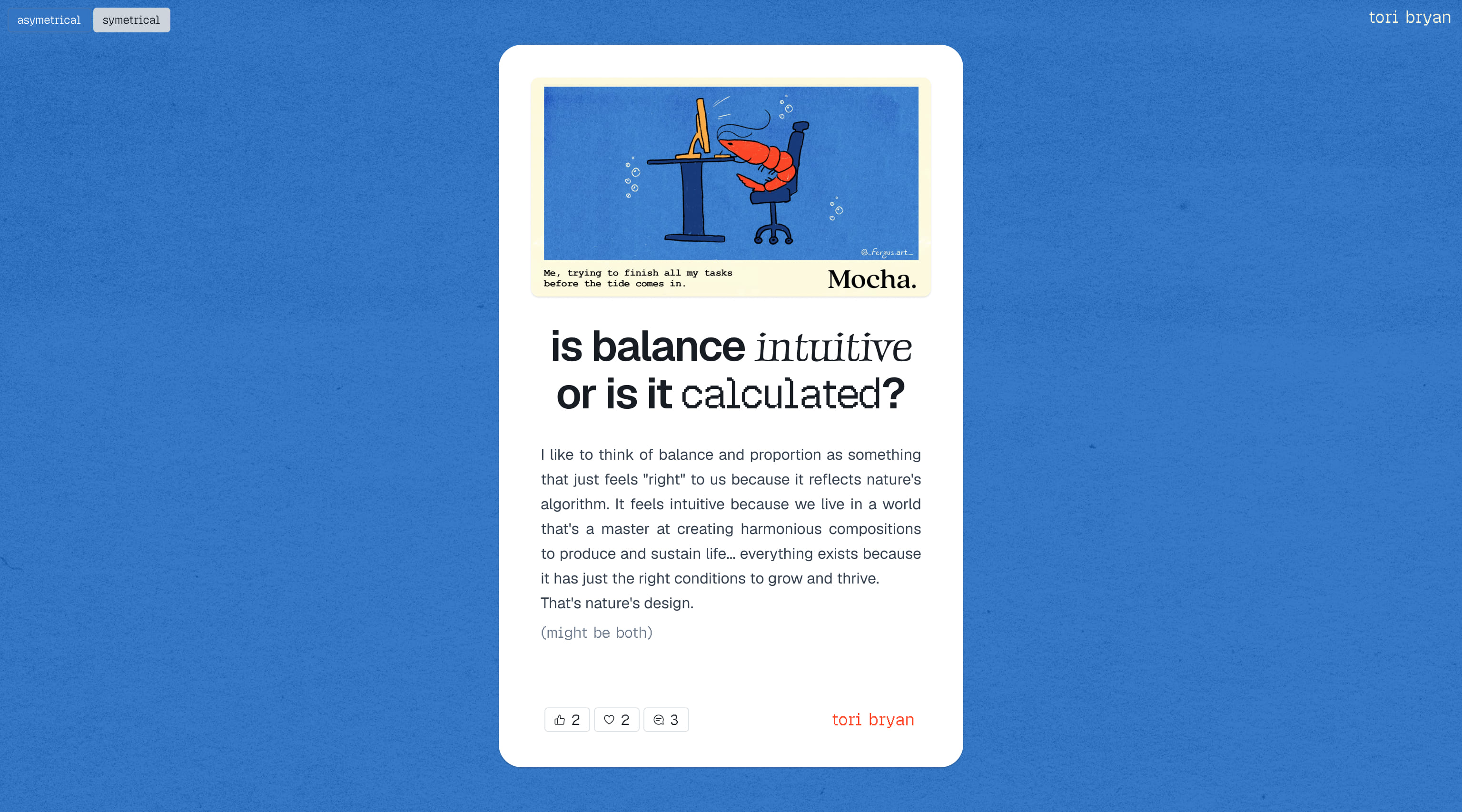
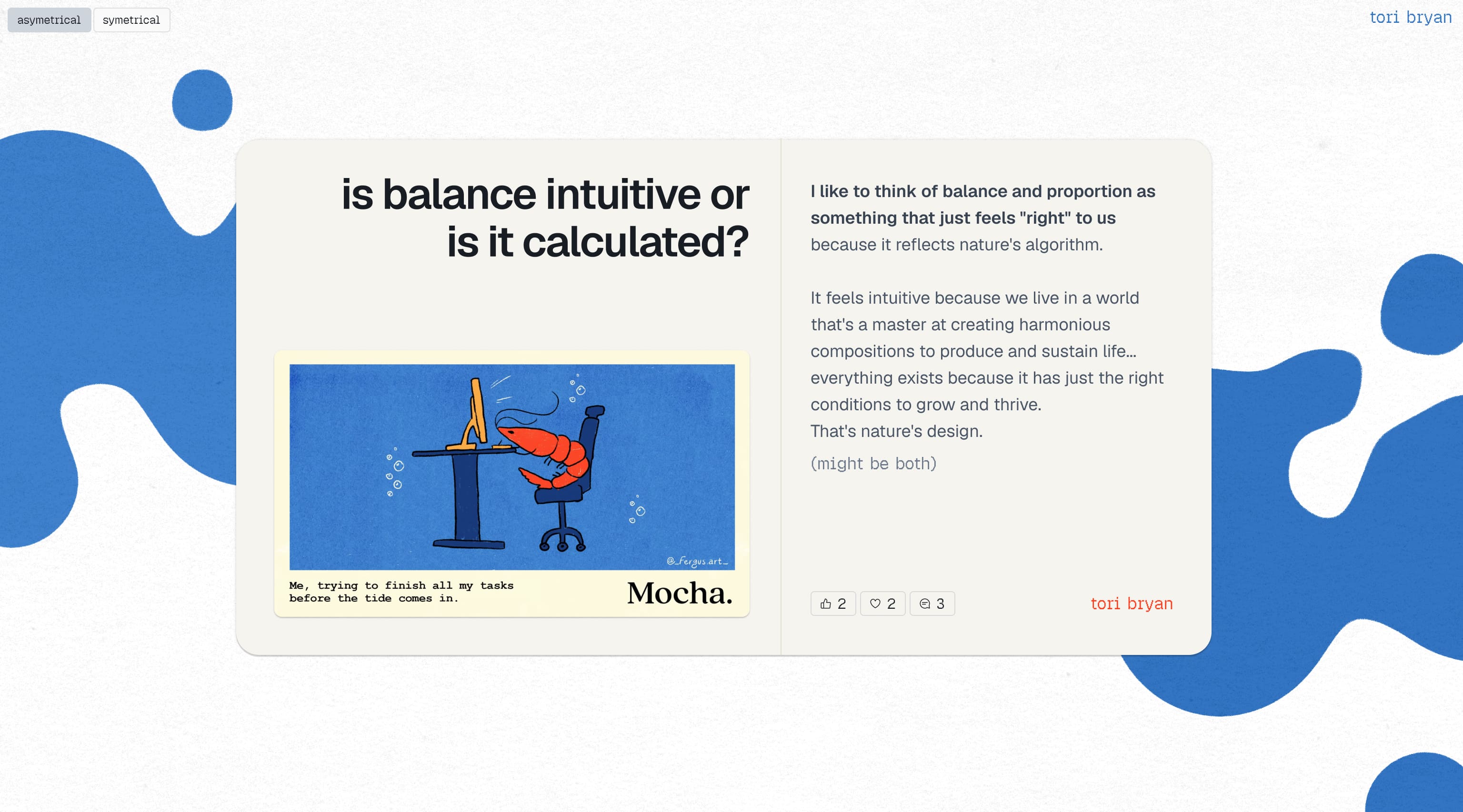
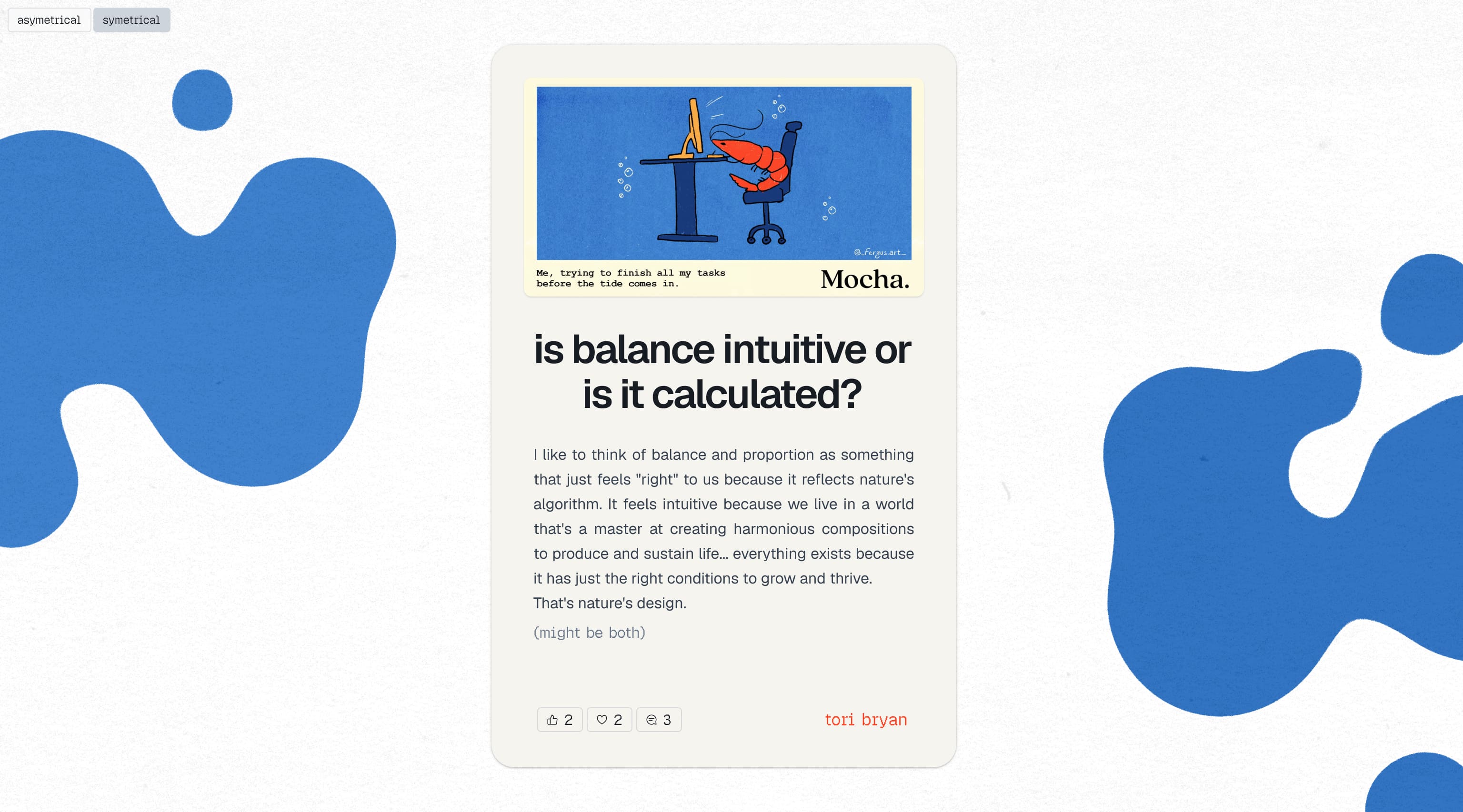
Instead of designing an interface about something else, I made the interface answer the prompt back. A magazine page, Mocha, with the layout itself doing the arguing.
Two aesthetic directions
I ran the pair twice. Once in a clean editorial treatment on solid blue. Once with organic blob shapes surrounding a lighter card. Same question, same answer, different arguments about what balance looks like on the page.
What I learned
The prompt asked for one idea in two versions. What made it click was letting the argument be the design: not designing about balance, but designing balance as an argument. Symmetry felt safer, more editorial. Asymmetry gave the layout the tension that mirrored the question itself.
Credits
Illustration by @fergus.art